| outcome | smoker | age |
|---|---|---|
| Alive | Yes | 23 |
| Alive | Yes | 18 |
| Dead | Yes | 71 |
| Alive | No | 67 |
| Alive | No | 64 |
17 Models of Yes/No Variables
The techniques studied up until now are intended to model quantitative response variables, those where the value is a number, for example height, wage, swimming times, or foot size. Categorical variables have been used only in the role of explanatory variables.
But sometimes the variation that you want to model occurs in a categorical variable. For instance, you might want to know what dietary factors are related to whether a person develops cancer. The variable “develops cancer” isn’t a number: it’s a yes-or-no matter.
There are good technical reasons why it’s easier to build and interpret models with quantitative response variables. For one, a residual from such a model is simply a number. The size of a typical residual can be described using a variance or a mean square. In contrast, consider a model that tries to predict whether a person will become an businessman or an engineer or a farmer or a lawyer. There are many different ways for the model to be wrong, e.g., it predicts farmer when the outcome is lawyer, or engineer when the outcome is businessman. The “residual” is not a number, so how do you measure how large it is?
This chapter introduces one technique for building and evaluating models where the response variable is categorical. The technique handles a special case, where the categorical variable has only two levels. Generically, these can be called yes/no variables, but the two levels could be anything you like: alive/dead, success/failure, engineer/not-engineer, and so on.
17.1 A simple model (that we don’t usually use)
17.1.1 The 0-1 encoding
The wonderful thing about yes/no variables is that they are always effectively quantitative; they can be naturally encoded as 0 for no and 1 for yes. Given this encoding, we could just use the standard linear modeling approach that we use for any other quantitative response variable. That’s what we’ll do at first, showing what’s good and what’s bad about this approach before moving on to a better method.
To illustrate using the linear modeling approach, consider some data that relate smoking and mortality. The table below gives a few of the cases from a data frame where women were interviewed about whether they smoked. In total there were 1314 subjects in the study.
Of course, all the women were alive when interviewed! The outcome variable indicates whether each woman was still alive 20 years later, during a follow-up study.
For instance, case 3 was 71 years old at the time of the interview. Twenty years later, she was no longer alive, so outcome is “Dead” for that subject.
We can use our usual 0-1 indicator variable outcomeAlive to indicate whether the woman was alive or dead at the follow-up. Remember that outcomeAlive codes “Alive” as 1 and “Dead” as 0. We could just as easily have used outcomeDead, which codes things the other way around, but outcomeAlive sounds more hopeful.
17.1.2 Fitting and interpreting the model
outcomeAlive is the variable we are interested in understanding; it will be the response variable in our model. smoker and age are potential explanatory variables. The simplest model of outcomeAlive is all-cases-the-same: outcomeAlive ~ 1. Here is the regression report from this model:
| term | Estimate | Std Error | t | p-value |
|---|---|---|---|---|
| (Intercept) | 0.719 | 0.0124 | 58.0 | <0.0001 |
The intercept coefficient in the model outcomeAlive ~ 1 has a simple interpretation; it’s the mean of the response variable. Because of the 0-1 coding, the mean is just the fraction of cases where the person was alive. That is, the coefficient from this model is just the probability that a random case drawn from the sample has an outcome of “Alive.”
At first that might seem a waste of modeling software, since you could get exactly the same result by counting the number of “Alive” cases and the number of “Dead” cases and converting those to proportions.
| outcome | count | proportion |
|---|---|---|
| Dead | 369 | 0.281 |
| Alive | 945 | 0.719 |
But notice that there is a bonus to the modeling approach – there is a standard error given that tells how precise the estimate is: \(0.719 \pm 0.024\) with 95% confidence.
The linear modeling approach also works sensibly with explanatory variables. Here’s the regression report on the model outcomeAlive ~ smoker:
| term | Estimate | Std Error | t | p-value |
|---|---|---|---|---|
| (Intercept) | 0.686 | 0.0166 | 41.4 | <0.0001 |
| smokerYes | 0.0754 | 0.0249 | 3.03 | 0.0025 |
You can interpret the coefficients from this model in a simple way – the intercept is mean of outcomeAlive for the non-smokers. The other coefficient gives the difference in the means between the smokers and the non-smokers. Since outcomeAlive is a 0-1 variable encoding whether the person was alive, the coefficients indicate the proportion of people in each group who were alive at the time of the follow-up study. In other words, it’s reasonable to interpret the intercept as the probability that a non-smokers was alive, and the other coefficient as the difference in probability of being alive between the non-smokers and smokers. We can express these as
- \(\hat P(\texttt{outcome} = \mbox{Alive} \mid \texttt{smoker} = \mbox{No})\), and
- \(\hat P(\texttt{outcome} = \mbox{Alive} \mid \texttt{smoker} = \mbox{Yes}) - \hat P(\texttt{outcome} = \mbox{Alive} \mid \texttt{smoker} = \mathrm{No})\).
or using indicator variables
- \(\hat P(\texttt{outcomeAlive} = 1 \mid \texttt{smokerYes} = 0)\), and
- \(\hat P(\texttt{outcomeAlive} = 1 \mid \texttt{smokerYes} = 1) - \hat P(\texttt{outcomeAlive} = 1 \mid \texttt{smokerYes} = 0)\)
The hats on the P’s indicate that these are model probabilities – the model’s estimates for what is happening in the population we are studying. This sort of probability is called a conditional probability since it specifies the probability for subjects how meet a specified condition, not for all subjects.
We could have used a similar notation for our other models as well. Here’s the notation for a simple linear model with one quantitative predictor and an intercept:
\[ \hat E(Y \mid X = x) = \hat \beta_0 + \hat\beta_1 x \] where E stands for expected value, another name for the mean. So this is a way of expressing that the model values are giving us the mean value of the response variable \(Y\) for a specified value of the explanatory variable. Our \(\hat Y\) notation hid some of this detail (the fact that we were interested in the mean and the particular values of the explanatory variables). We can use the more verbose notation any time those details are especially important or aren’t clear from context.
Note
The condition always goes on the right side of the vertical bar in this notation.
With that bit of notation in hand, let’s return to our story. Again we could have found this result in a simpler way: just count the fraction of smokers and of non-smokers who were alive.
| No | Yes | |
|---|---|---|
| Dead | 230 | 139 |
| Alive | 502 | 443 |
| Total | 732 | 582 |
| No | Yes | |
|---|---|---|
| Dead | 0.3142 | 0.2388 |
| Alive | 0.6858 | 0.7612 |
| Total | 1 | 1 |
Table 17.5: Counts and proportions of “dead” and “alive” cases among smokers and non-smokers in the Whickham study.
The advantage of the modeling approach is that it produces a standard error for each coefficient and a p-value. The intercept says that \(0.686 \pm 0.033\) of non-smokers were alive. The smokerYes coefficient says that an additional \(0.075 \pm 0.05\) of smokers were alive.
This result might be surprising to you, since most people expect that mortality is higher among smokers than non-smokers. But the confidence interval does not include 0 or any negative number. Correspondingly, the p-value in the report is small: the null hypothesis that smoker is unrelated to outcome can be rejected.
Perhaps it’s obvious that a proper model of mortality and smoking should adjust for the age of the person. After all, age is strongly related to mortality and smoking might be related to age. Here’s the regression report from the model outcomeAlive ~ smoker + age:
| term | Estimate | Std Error | t | p-value |
|---|---|---|---|---|
| (Intercept) | 1.47 | 0.0301 | 48.9 | <0.0001 |
| smokerYes | 0.0105 | 0.0196 | 0.535 | 0.5927 |
| age | −0.0162 | 0.000558 | −28.9 | <0.0001 |
It seems that the inclusion of age has had the anticipated effect. According to the coefficient −0.016, there is a negative relationship between age and being alive. According to this model, both smokers and non-smokers who are one year older are 1.6% more likely to die within 20 years. (Because this model has not interaction term, it can only estimate a common change for both groups.) The standard error is quite small and the p-value is extremely small. So the model is quite certain about this estimate, and extremely certain that the value is negative.
The effect of smoker has been greatly reduced in this model compared to the previous model; the p-value 0.59 is much too large to reject the null hypothesis that smoking and mortality are unrelated for women who are the same age. These data in fact give little or no evidence that smoking is associated with mortality. It’s well established that smoking increases mortality, but the number of people involved in this study, combined with the relatively young ages of the smokers, means that the power of the study was small.
17.1.3 A problem with this model
Despite the relative simplicity of this approach and the reasonable results it appears to be producing, this type of model has a potential problem, and it is rarely used because of this problem.
Consider the fitted model value for a 20-year old smoker:
\[ \hat P(\texttt{outcomeAlive = 1} \mid \texttt{smokerYes} = 1) = 1.47 + 0.010 \cdot 1 - 0.016 \cdot 20 = 1.16 \] This value, 1.16, can’t be interpreted as a probability that a 20-year old smoker would still be alive at the time of the follow-up study (when she would have been 40). Probabilities must always be between 0 and 1. But lines with non-zero slope will always go below 0 and above 1 somewhere. If that somewhere is within the region of interest for our model (like people who are 20 years old), then the model will start to say silly things. That’s not the model’s fault really. We told it to treat the 0-1 response just like any other quantitative response, and it did just that. We didn’t say anything about wanting to get back a value we could interpret as a probability.
The top panel of Figure 17.1 shows the fitted model values for the linear model along with the actual data. (Since the outcomeAlive variable is coded as 0 or 1, it’s been jittered slightly up and down so that the density of the individual cases shows up better. Smokers are at the bottom of each band.) The data show clearly that older people are more likely to have died. Less obvious in the figure is that the very old people also tended not to smoke.
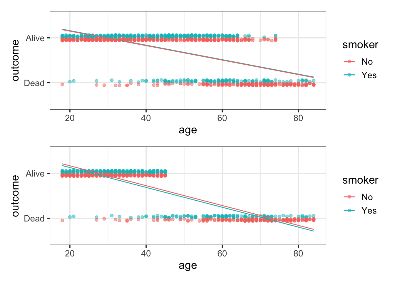
The problem with the linear model is that it is too rigid, too straight. In order for the model to reflect that the large majority of people in their 40s and 50s were alive, the model overstates survival in the 20-year-olds. This isn’t actually a problem for the 20-year-olds – the model values clearly indicate that they are very likely to be alive. But what isn’t known is the extent to which the line has been pulled down to come close to 1 for the 20-year olds, thereby lowering the model values for the middle-aged folks.
To illustrate how misleading the straight-line model can be, let’s conduct a small thought experiment and delete all the “alive” cases above the age of 45. The resulting data and the best-fitting linear model are shown in the bottom panel of Figure 17.1.
The thought-experiment model is completely wrong for people in their 50s. Even though there are no cases whatsoever where such people are alive, the model value is around 50%.
17.2 A Better Model: Logistic Regression
What’s needed is a more flexible model – something not quite so rigid as a line, something that can bend to stay in the 0-to-1 bounds of legitimate probabilities. There are many ways that this could be accomplished. The one that is most widely used is exceptionally effective, clever, and perhaps unexpected. It consists of a two-stage process:
Construct model values in the standard linear way – multiplication of coefficients times model vectors. The model
outcomeAlive ~ age + smokerwould involve the familiar terms: an intercept, a vector forage, and the indicator vector forsmokerYes. The output of the fitted linear formula – let’s call it \(Y\) – is not a probability but rather a link value: an intermediary of the fitting process.Rather than taking the link value \(Y\) as the model value, we will transform \(Y\) into another quantity \(P\) that it is bounded by 0 and 1. A number of different transformations could do the job, but the most widely used one is called the logistic transformation:
\[ P = \exp(Y) /(1 + \exp(Y)) \]
The resulting type of model is called a logistic regression model. This model assumes this relationship between the explanatory variables and the probability \(P\), via the link value \(Y\). The choice of the best coefficients – the model fit – is based not directly on how well the link values \(Y\) match the data but on how the probability values \(P\) match the data. Once we have fit the model to our data and have coefficient estimates, we can add hats to denote that the value of \(Y\) is being estimated, and therefore also the value of \(P\):
\[ \hat P = \exp(\hat Y) /(1 + \exp(\hat Y)) \]
Figure 17.2 illustrates the logistic form on the smoking/mortality data. The logistic transformation lets the model fit the outcomes for the very young and the very old, while maintaining flexibility in the middle to match the data there. In our thought experiment, the model can quickly drop from a high probability of surviving for young women to a low probability for older women.

outcomeAlive ~ age + smoker. Top: The smoking/mortality data. Bottom: The thought experiment in which the ‘Alive’ cases above age 45 were eliminated.The two-stage approach to logistic regression makes it straightforward to add explanatory terms in a model. Whatever terms there are in a model – main terms, interaction terms, nonlinear terms – the logistic transformation guarantees that the model probabilities \(\hat P\) will fall nicely in the 0-to-1 scale. Figure 17.3 shows how the link value \(\hat Y\) is translated into the 0-to-1 scale of \(\hat P\) for different “shapes” of models.
![]()
17.2.1 Why logistic?
In principle, we could use any transformation that converts any real number (a possible link value from our linear model) into a value between 0 and 1 (a probability). The logistic transformation has many special properties that make it a good choice, although this is not immediately obvious from the functional form above.
It can be helpful to think about the transformation in reverse: converting probabilities into link values. Let’s to that in two stages. In the first stage, we convert probabilities into values that can take on any positive value. In the second stage we stretch that out so the values can take on any number, positive or negative.
Stage 1: \(P \to \frac{P}{1-P}\)
You may recognize this as the odds. Since \(P\) is between 0 and 1, the odds will always be positive. When \(P\) is close to 0, then the odds will also be close to 0;
when \(P = 0.5\), then odds are 1; when \(P\) is close to 1, then \(1 - P\) is very small, which makes the fraction very large.Stage 2: \(\mbox{odds} \to \log(\mbox{odds})\)
The logarithm function takes positive numbers as inputs and can return any real number. When the odds are 1 (so \(P = 0.5\)), then \(\log(\mbox{odds}) = 0\). \(\log(\mbox{odds})\) is positive when the odds are greater than 1 (i.e., when \(P > 0.5\)), and \(\log(\mbox{odds})\) is negative when the odds are less than 1 (i.e., when \(P < 0.5\)).
Step 1 & Step 2: \(P \to \log\left(\frac{P}{1-P}\right)\)
A little algebra will show that this is exactly the reverse of the logistic function. It is called the logit or log odds function.
Because odds are just another way to talk about probability (and familiar to people who bet on certain types of events), using the logistic/logit transformation means that some aspects of our models will have reasonably natural interpretations. For example, a slope coefficient of our model will tell us how fast the log odds of outcome 1 change as the explanatory variable changes.
Important properties of logs and exponentials
Note: the logarithms used in this chapter, and in most situations in statistics are natural logarithms, logarithms base \(e\). Working with other bases would give equivalent, but not identical results. It is important to know which base is being used whenever working with logarithms.
\(\exp(x) = e^x\) where \(e\) is Euler’s constant, which is roughly 2.7183.
You may wonder why we choose such an odd number for the base. In other contexts people use the base 10 (e.g., the Richter scale, decibals) or the base 2 (half lifes, doubling time, computer science applications). But \(e\) is the unique number that makes calculus work out most beautifully. (For those who know some calculus, the magic property of \(\exp(x) = e^x\) is that it is equal to its derivative.)
\(\log()\) and \(\exp()\) are inverses: \(\log(exp(x)) = x = \exp(\log(x))\).
- \(\exp(0) = 1\), so \(log(1) = 0\).
- Inputs to \(\exp()\) may be any positive numbers, the output is always positive. This means that inputs to \(\log()\) must be positive numbers, the outputs can be any number.
Both functions are increasing functions.

Figure 17.4: Logarithm and exponential functions. The exponential function grows more and more quickly as its inputs get larger. The logarithm does just the opposite, it grows more and more slowly as its inputs get larger.
Logs turn products into sums, quotients in to differences, and powers into products:
- \(\log(AB) = \log(A) + \log(B)\)
- \(\log(A/B) = \log(A) - \log(B)\)
- \(\log(A^x) = x \log(A)\)
17.2.2 A useful property of odds
Perhaps you do not like that logistic regression is based on odds, and log odds at that. We can always convert back to probability, which is more familiar, but it turns out that odds are also useful on their own. Here is an example.
Let’s suppose we are doing a study to see whether men who eat a lot meat are more likely to develop prostate cancer than those who eat less meat. For now, let’s keeps things very simple and suppose that we categorize mean into high intensity meat eaters and low intensity meat eaters. Because most men don’t have prostate cancer, we decide to sample separately from men with and without prostate cancer so we don’t get so many more men without prostate cancer than with.
Let suppose we sample 200 of each and the results (again keeping things very simple in this thought experiment) look like this
| No Cancer | Cancer | Total | |
|---|---|---|---|
| Hi | 80 | 160 | 240 |
| Low | 120 | 40 | 160 |
| Total | 200 | 200 | 400 |
Now let’s calculate the probability of getting cancer for each group of meat eaters in this study:
- \(P(C | H) = 160 / 240 = 2/3\)
- \(P(C | L) = 40 / 160 = 1/4\)
A reasonable way to compare these is with a ratio of probabilities, the relative risk:
- \(RR = \frac{2/3}{1/4} = \frac{8}{3} = 2.667\)
But since we know about odds, we could also compute the odds ratio:
- \(OR = \frac{\left(\frac{2/3}{1/3}\right) }{\left( \frac{1/4}{3/4} \right)} = \frac{2/1}{1/3} = 6\).
Notice that the probabilities and odds involved do not reflect those in the population since in reality, most men don’t have prostate cancer. So a random sample from all men might look more like this:
| No Cancer | Cancer | Total | |
|---|---|---|---|
| Hi | 800 | 16 | 816 |
| Low | 1200 | 4 | 1204 |
| Total | 2000 | 20 | 2020 |
Let’s compute RR and OR from this table:
\(RR = \frac{16/816}{4/1204} = 5.902\)
\(OR = \frac{16/800}{4/1200} = \frac{16}{4} \cdot \frac{3}{2} = 6\)
So the odds ratio remains constant when we rescale to the population proportions of men with and without cancer, but the relative risk does not. This means that we can use this kind of sampling to more efficiently estimate an odds ratio that if we merely sampled from the population at large. Unfortunately, this is not true of the relative risk, which most people find easier to understand.
But notice too that the second relative risk is very similar to the odds ratio. This reflects a general principle. Let’s call the two probabilities \(p\) and \(q\), then
\[ OR = \frac{p / (1-p)}{q / (1-q)} = \frac{p}{q} \cdot \frac{1-q}{1-p} = RR \cdot \frac{1-q}{1-p} \]
When \(p\) and \(q\) are small, then \(1-p\) and \(1-q\) are both close to 1, and so is their ratio. So in this case, the relative risk and odds ratio will be very similar. This works to our advantage when studying rare things, like the occurrence of a rare disease, since the odds ratio, which has nicer mathematical properties, will be very similar to the relative risk, which is easier for most people to understand.
We will return to this example later in the chapter, where will see how this relates to logistic regression models used in an actual study of prostate cancer and meat eating. But first we need to learn a bit more about logistic regression models.
17.3 Inference on Logistic Models
The interpretation of logistic models follows the same logic as in linear models. Each case has a model probability value. For example, the model probability value for a 64-year old non-smoker is 0.4215, while for a 64-year old smoker it is 0.3726. These model values are in the form of probabilities; the 64-year old non-smoker had a 42% chance of being alive at the time of the follow-up interview.
There is a regression report for logistic models. Here it is for outcome ~ age + smoker:
| term | Estimate | Std Error | t | p-value |
|---|---|---|---|---|
| (Intercept) | 7.5992 | 0.44123 | 17.223 | <0.0001 |
| age | −0.12368 | 0.0071769 | −17.233 | <0.0001 |
| smokerYes | −0.20470 | 0.16842 | −1.2154 | 0.2242 |
Notice the labeling in the caption of the table. Let’s unpack that a bit.
logit
We have talked about the logit function, so we know where that enters in.
binomial
Since our responses are Yes/No, Success/Fail, this is exactly the setting for a binomial distribution. Logistic regression is based on binomial distributions rather than the normal distributions of the linear models we have seen so far.
generalized linear model (glm)
This is a hint that we could do a similar thing with some other link function in place of the logit function and some other family of distributions in place of the binomial family. Indeed, this is the case. A wide range of scenarios can be handled in a similar way just be choosing different link functions and families of distributions. We won’t cover those in this text, but it is good to be aware that learning logistic regression is giving us our first glimpse at a more general framework.
Actually, it is our second glimpse. The standard linear model we have seen to this point also fits into this framework. It uses the normal distributions together with the identity (no change) transformation. Since the transformation for a standard linear model doesn’t do anything, we never need to worry about it before. But we could say those models are “fitting a generalized (normal/identity) linear model”.
The coefficients in this model are on the link scale. So for the 64-year old non-smoker the value is \(Y = 7.59922 - 0.12368 \cdot 64 = -0.3163\). This value is not a probability; it’s negative, so how could it be? This is the log odds. To get the model probability from the log odds, we need to apply the logistic transformation:
\[ \hat P(\texttt{outcomeAlive} = 1 \mid \texttt{smokerYes} = 0, \texttt{age} = 64) = \frac{\exp(-0.3163)}{1 + \exp(-0.3163)} = 0.4215 \]
Note
Statistical software will often have this transformation function built in, which will save a little bit of typing. It might go by the name logistic, but in might also be called the inverse logit function. It’s the same thing whichever name it has.
The logistic regression report includes standard errors and p-values, just as in the ordinary linear regression report. Even if there were no regression report, you could generate the information by resampling, using bootstrapping to find confidence intervals and doing hypothesis tests by randomization tests.
One difference between this report and the reports we have seen before is that the test statistic is \(z\) (normal) rather than \(t\). That’s because the binomial distributions don’t have a separate standard deviation parameter like the normal distributions do, so we don’t need to use the shorter, fatter t-distributions in this situation.
In the regression report for the model above, you can see that the null hypothesis that age is unrelated to outcome can be rejected. (That’s no surprise, given the obvious tie between age and mortality.) On the other hand, these data provide at best only very weak evidence that there is a difference between smokers and non-smokers; the p-value is 0.22.
An ANOVA-type report can be made for logistic regression. This involves the same sort of reasoning as in linear regression: fitting sequences of nested models and examining how the residuals are reduced as more explanatory terms are added to the model.
17.3.1 Residuals and fitting a logistic model
It’s time to discuss the residuals from logistic regression. Obviously, since there are response values (the 0-1 encoding of the response variable) and there are model values, there must be residuals. The obvious way to define the residuals is as the difference between the response values and the model values, just as is done for linear models. If this were done, the model fit could be chosen as that which minimizes the sum of square residuals.
Although it would be possible to fit a logistic-transform model in this way, it is not the accepted technique. To see the problem with the sum-of-square-residuals approach, think about the process of comparing two candidate models. The table below gives a sketch of two models to be compared during a fitting process. The first model has one set of model values, and the second model has another set of model values.
| Case | 1st Model | 2nd Model | Observed Value |
|---|---|---|---|
| 1 | 0.8 | 1.0 | 1 |
| 2 | 0.1 | 0.0 | 1 |
| 3 | 0.9 | 1.0 | 1 |
| 4 | 0.5 | 0.0 | 0 |
| Sum. Sq. Resid. | 1.11 | 1.00 |
Which model is better? Let’s compute the sum of square residuals (RSS) for each model.
- Model 1 RSS \(= (1-0.8)^2 + (1-0.1)^2 + (1-0.9)^2 + (0-0.5)^2 = 1.11\);
- Model 2 RSS \(= (1-1.0)^2 + (1-0.0)^2 + (1-1.0)^2 + (0-0.0)^2 = 1.00\).
Conclusion: the second model is to be preferred, if we base the decision on RSS.
However, despite the sum of squares, there is a good reason to prefer the first model. For Case 2, the Second Model gives a model value of 0 – this says that it’s impossible to have an outcome of 1. But, in fact, the observed value was 1; according to the Second Model the impossible has occurred! The First Model has a model value of 0.1 for Case 2, suggesting it is merely unlikely that the outcome could be 1.
The actual criterion used to fit logistic models penalizes heavily – infinitely in fact – candidate models that model as impossible events that can happen. The criterion for fitting is called maximum likelihood. Likelihood is defined to be the probability of the observed response values according to the probability values of the candidate model. When the observed value is 1, the likelihood of the single observation is just the model probability. When the observed value is 0, the likelihood is 1 minus the model probability. The overall likelihood is the product of the individual likelihoods of each case.
- Model 1 Likelihood \(= 0.8 \cdot 0.1 \cdot 0.9 \cdot (1-0.5) = 0.036\).
- Model 2 Likelihood \(= 1 \cdot 0 \cdot 1 \cdot (1-0)=0\).
So the first model wins if we base the decision of likelihood.
It might seem that the likelihood criterion used in logistic regression is completely different from the sum-of-square-residuals criterion used in linear regression. It turns out that if we used maximum likelihood instead of least squares for our simple linear models, we would get exactly the same estimates! A key insight is that one can define a probability model for describing residuals and, from this, compute the likelihood of the observed data given the model.
17.3.2 Deviance
In the maximum likelihood framework, the equivalent of the sum of squares of the residuals is a quantity called the deviance:
\[ \mbox{deviance} = - 2 \log(\mbox{likelihood}) \] Using the deviance rather than likelihood does a few things for us.
It keeps the values in a more moderate range.
Likelihood values tend to be very small, especially for large data sets because we keep multiplying probabilities and each time we do the value gets smaller. But logarithms of very small numbers are not nearly so small. For example, the logarithm of one millionth is
r{ log(1E-6) |> signif (3). It also turns products into sums. Both of these lead to more efficient and stable computations in software.Using a negative means that we can minimize instead of maximize.
Also, since likelihoods are small, their logarithms are negative. So this makes that deviance (in most cases) positive. This will feel more like doing least squares – trying to make something positive as small as possible.
The deviance has a known distribution when null hypotheses are true.
There are some historical and theoretical reasons for the 2. We won’t concern ourselves much with that. Just know that it makes the distributions work out better.
Just as the linear regression report gives the sum of squares of the residual, the logistic regression report gives the deviance. It serves essentially the same role.
To illustrate, here is a larger logistic regression report that includes some information about deviance.
| term | Estimate | Std Error | t | p-value |
|---|---|---|---|---|
| (Intercept) | 7.60 | 0.441 | 17.2 | <0.0001 |
| age | −0.124 | 0.00718 | −17.2 | <0.0001 |
| smokerYes | −0.205 | 0.168 | −1.22 | 0.2242 |
The null deviance refers to the deviance for the simple model outcome ~ 1: it’s analogous to the sum of squares of the residuals from that simple model. The reported degrees of freedom, 1313, is the sample size \(n\) minus the number of coefficients \(m\) in the model. That’s \(m=1\) for outcome ~ 1 because that model has just a single coefficient – the intercept. For the smoker/mortality data in the example, the sample size is \(n=1314\). The line labelled “Residual deviance” reports the deviance from the full model: outcome ~ age + smoker. The full model has three coefficients altogether: the intercept, a coefficient for age, and a coefficient for smokerYes, leaving \(1314 - 3 = 1311\) degrees of freedom in the deviance.
Sometimes this information is presented in an “ANOVA” table, but it isn’t really analysis of variance anymore, it is analysis of deviance:
| term | Resid..df | Resid. Dev | df | Deviance |
|---|---|---|---|---|
| outcome ~ 1 | 1313 | 1,560 | ||
| outcome ~ age + smoker | 1311 | 945 | 2.00 | 615 |
According to the report, the age and smokerYes vectors reduced the deviance from 1560.32 to 945.02. The deviance is constructed in a way so that a random, junky explanatory vector would, on average, consume a proportion of the deviance equal to 1 over the degrees of freedom. Thus, if you constructed the outcome ~ age + smoker + junk, where junk is a random, junky term, you would expect the deviance to be reduced by a fraction \(1/1311\). This also means that if we added random junk twice to the null model, we would expect a change in deviance of about \(2/1313\). Clearly our model did much better than that.
To perform a hypothesis test for a coefficient, we can compare the actual amount by which a model term reduces the deviance to the amount expected for random terms. This is analogous to the F test, but involves a different probability distribution called the Chi-squared distribution with one degree of freedom. We can denote this as \(\mathsf{Chisq(1)}\) or \(\chi^2_1\). The end result, as with the F test, is a p-value which can be interpreted in the conventional way, just as you do in linear regression.
The \(\mathsf{Chisq(1)}\) distribution is what we get when we square a \(\mathsf{Norm(0, 1)}\) random variable. So it is easy to convert these 1-degree of freedom tests to a normal scale, just like we could convert between \(t\) and \(F\) for 1-degree of freedom tests. If you square the \(z\) values in the coefficients table, you will get the corresponding chi-squared value. probability P = 0.4215. According to the model, this is the probability
To perform a model utility test, we can do the same thing, but this time comparing the deviance of the model to the deviance of the null model. Once again, the distribution will be chi-squared, this time with degrees of freedom equal to the number of coefficients in the full model (i.e., the change in degrees of freedom between the two models).
Mostly, we don’t need to know these details. It is more important to understand
- What hypothesis is being tested, and
- How we can get software to provide us with the p-value for that test.
17.4 Interpreting model coefficients as odds ratios
From logistic regression output we can read off a p-value or a confidence interval for one of the coefficients. And we can convert model coefficients and a combination of explanatory variable values into link values and probability values. But what do the coefficients mean?
For the least squares regression models, we interpreted the coefficients as “slopes”. The units were ratios of units for the response variable by units for the explanatory variable. They are still slopes – but on the log odds (link) scale. Let’s look again at our model for mortality and smoking:
| term | Estimate | Std Error | t | p-value |
|---|---|---|---|---|
| (Intercept) | 7.60 | 0.441 | 17.2 | <0.0001 |
| age | −0.124 | 0.00718 | −17.2 | <0.0001 |
| smokerYes | −0.205 | 0.168 | −1.22 | 0.2242 |
The coefficient on age, \(-0.1237\), estimates that the log odds of surviving (being alive 20 years after the initial study) goes down by \(0.1237\) for each year. This this is a decrease (and since the p-value is small and confidence interval does not include 0), qualitatively, this tells us that survival rates go down as age goes up. Older people were less likely to be alive 20 years after the initial study. We can write this
\[ \operatorname{log odds}(\texttt{outcomeAlive} = 1 \mid \texttt{age} = x + 1, \texttt{smokerYes} = s) - \operatorname{log odds}(\texttt{outcomeAlive} = 1 \mid \texttt{age} = x, \texttt{smokerYes} = s) = -0.1237 \]
Since \(\log(A) - \log(B) = \log(A / B)\), we can rewrite this as
\[ \log\left( \frac{\operatorname{odds}(\texttt{outcomeAlive} = 1 \mid \texttt{age} = x + 1, \texttt{smokerYes} = s)}{ \operatorname{odds}(\texttt{outcomeAlive} = 1 \mid \texttt{age} = x, \texttt{smokerYes} = s)} \right) = -0.1237 \]
In other words, the “slopes” of a logistic regression model are log odds ratios. If we want the odds ratio, we can exponentiation to get it:
\[ \mbox{odds ratio} = \exp(-0.1237) = 0.8836 \]
This gives us two ways to interpret our logistic regression models:
We can convert particular combinations of explanatory variables into probabilities (via the link) and compare those probabilities.
We can interpret the coefficients as log odds ratios, or exponentiate to get an odds ratio.
17.5 Model Probabilities
The link values \(Y\) in a logistic regression are ordinary numbers that can range from \(-\infty\) to \(\infty\). The logistic transform converts link values \(Y\) to numbers \(P\) on the scale 0 to 1, which can be interpreted as probabilities. We’ll call the values \(P\) model probabilities to distinguish them from the sorts of model values found in ordinary linear models or from the link values that arise in logistic regression. The model probabilities describe the chance that the Yes/No response variable takes on the level “Yes.”
To be more precise, \(\hat P\) is a model’s estimate for a conditional probability. That is, it estimates the probability of a “Yes” outcome conditioned on the explanatory variables in the model. In other words, the model probabilities are probabilities given the value of the explanatory variables. For example, in the model outcome ~ age + smoker, the link value for a 64-year old non-smoker is \(\hat Y = -0.3163\) corresponding to a model that a person who was 64 and a non-smoker was still alive at the time of the follow-up interview. That is to say, the probability is 0.4215 of being alive at the follow-up study conditioned on being age 64 and non-smoking at the time of the original interview. Change the values of the explanatory variables – look at a 65-year old smoker, for instance – and the model probability changes.
There is another set of factors that affects the model probabilities: the situation that applied to the selection of cases for the data set. For instance, fitting the model outcome ~ 1 to the smoking/mortality data gives a model probability for “Alive” of \(\hat P=0.672\). It would not be fair to consider this a good estimate for the probability that a random woman will still be alive in 20 years unless the sample was chosen in a way that is representative of the population. That is, any woman of any age and smoking behavior in the target population would be equally likely to be in the sample.
Only if the sample is representative of a broader population is it fair to treat that probability as applying to that population. If the overall population doesn’t match the sample – for example, if we only selected women of a certain age, or designed the study to give roughly equal numbers of smokers and non-smokers, regardless of their relative portions of the population – then the probability from the model fitted to the sample won’t necessarily match the probability of “Alive” in the overall population.
Even if it is not the case that all members of the population had an equal chance to bin our sample, or even that the sample is similarly representative despite using a different sampling mechanism, something weaker may be true. If we are studying the model outcome ~ age + sex, what we need is that the mortality rates for subjects in our study of any particular age and smoking status are representative of those rates in the population. So even if our sample doesn’t represent the age-demographics or smoking proportions of the population (perhaps we intentionally wanted roughly equal numbers of smokers and non-smokers with an even distribution of ages for each, even thought the proportions are not equal in the general population), as long as the 50-year old smokers in the study are representative of 50-year old smokers in the population (and similarly for any other age and smoking status combination) with respect to mortality, then the conditional probabilities of our model can be used to infer information about those conditional probabilities in the population.
In other words, we need our sample to be representative of the conditional probabilities we are trying to infer.
Example 17.1 (Example: Prostate Cancer) To illustrate, consider a study done by researchers in Queensland, Australia on the possible link between cancer of the prostate gland and diet. Pan-fried and grilled meats are a source of carcinogenic compounds such as heterocyclic amines and polycyclic aromatic hydrocarbons. Some studies have found a link between eating meats cooked “well-done” and prostate cancer (Koutros and al. 2008). The Queensland researchers (Minchin 2008) interviewed more than 300 men with prostate cancer to find out how much meat of various types they eat and how they typically have their meat cooked. They also interviewed about 200 men without prostate cancer to serve as controls. They modeled whether or not each man has prostate cancer (variable pcancer) using both age and intensity of meat consumption as the explanatory variables. Then, to quantify the effect of meat consumption, they compared high-intensity eaters to low-intensity eaters; the model probability at the 10th percentile of intensity compared to the model probability at the 90th percentile. For example, for a 60-year old man, the model probabilities are 69.8% for low meat-intensity eaters, and 82.1% for high meat-intensity eaters.
It would be a mistake to interpret these numbers as the probabilities that a 60-year old man will have prostate cancer. The prevalence of prostate cancer is much lower. (According to one source, the prevalence of clinically evident prostate cancer is less than 10% over a lifetime, so many fewer than 10% of 60-year old men have clinically evident prostate cancer.)
The sample was collected in a way that intentionally overstates the prevalence of prostate cancer. More than half of the sample was selected specifically because the person had prostate cancer. Given this, the sample is not representative of the overall population. In order to make a sample that matches the overall population, there would have had to be many more non-cancer controls in the sample.
However, there’s reason to believe that the sample reflects in a reasonably accurate way the diet practices of those men with prostate cancer and also of those men without prostate cancer. As such, the sample can give information that might be relevant to the overall population, namely how meat consumption could be linked to prostate cancer. For example, the model indicates that a high-intensity eater has a higher chance of having prostate cancer than a low-intensity eater. Comparing these probabilities – 82.1% and 69.8% – might give some insight.
There is an effective way to compare the probabilities fitted to the sample so that the results can be generalized to apply to the overall population. It will work so long as the different groups in the sample – here, the men with prostate cancer and the non-cancer controls – are each representative of that same group in the overall population. It’s tempting to compare the probabilities directly as a ratio to say how much high-intensity eating increases the risk of prostate cancer compared to low-intensity eating. This ratio of model probabilities is 0.821/0.698, about 1.19. The interpretation of this is that high-intensity eating increases the risk of cancer by 19%.
Unfortunately, because the presence of prostate cancer in the sample doesn’t match the prevalence in the overall population, the ratio of model probabilities usually will not match that which would be found from a sample that does represent the overall population.
Rather than taking the ratio of model probabilities, it turns out to be better to consider the odds ratio. Even though the sample doesn’t match the overall population, the odds ratio will (so long as the two groups individually accurately reflect the population in each of those groups).
Remember that odds are just another way of talking about probability P. Rather than being a number between 0 and 1, an odds is a number between 0 and \(\infty\). The odds is calculated as \(P/(1-P)\). For example, the odds \(0.50 / (1-0.50) = 0.5 / 0.5 = 1\) corresponds to a probability or \(P=50\)% . Everyday language works well here: the odds are fifty-fifty.
The odds corresponding to the low-intensity eater’s probability of \(P=69.8\)% is \(0.698 / 0.302 = 2.31\). Similarly, the odds corresponding to high-intensity eater’s \(P=82.1\)% is \(0.821 / 0.179 = 4.60\). The odds ratio compares the two odds: \(4.60 / 2.31 = 1.99\), about two-to-one.
Why use a ratio of odds rather than a simple ratio of probabilities (often called the relative risk? Because the sample was constructed in a way that doesn’t accurately represent the prevalence of cancer in the population.
The ratio of probabilities would reflect the prevalence of cancer in the sample: an artifact of the way the sample was collected. The odds ratio compares each group – cancer and non-cancer – to itself and doesn’t depend on the prevalence in the sample.
One of the nice features of the logistic transformation is that the link values Y can be used directly to read off the logarithm of odds ratios.
In the prostate-cancer data, the model
\[ \texttt{pcancer} \sim \texttt{age} + \texttt{intensity} \]
has these coefficients:
| Estimate | Std. Error | z value | p-value | |
|---|---|---|---|---|
| Intercept | 4.274 | 0.821 | 5.203 | 0.0000 |
| Age | −0.057 | 0.012 | −4.894 | 0.0000 |
| Intensity | 0.172 | 0.058 | 2.961 | 0.0031 |
These coefficients can be used to calculate the link value Y which corresponds to a log odds. For example, in comparing men at 10th percentile of intensity to those at the 90th percentile, you multiply the intensity coefficient by the difference in intensities. The bottom 10th percentile is 0 intensity and the top 10th percentile is an intensity of 4. So the difference in Y score for the two percentiles is \(0.1722 \cdot (4 - 0) = 0.6888\). This value, 0.6888, is the log odds ratio. To translate this to an odds ratio, you need to undo the log. That is, calculate \(\exp(0.6888) = 1.99\). So, the odds ratio for the risk of prostate cancer in high-intensity eaters versus low-intensity eaters is approximately 2.
Note that the model coefficient on age is negative. This suggests that the risk of prostate cancer goes down as people age. This is wrong biologically as is known from other epidemiological work on prostate cancer, but it does reflect that the sample was constructed rather than randomly collected. Perhaps it’s better to say that it reflects a weakness in the way the sample was constructed: the prostate cancer cases tend to be younger than the non-cancer controls. If greater care had been used in selecting the control cases, they would have matched exactly the age distribution in the cancer cases. Including age in the model is an attempt to adjust for the problems in the sample – the idea is that including age allows the model’s dependence on intensity to be treated as if age were held constant.