| group | groupA | groupB | groupC | groupD |
|---|---|---|---|---|
| A | 1 | 0 | 0 | 0 |
| B | 0 | 1 | 0 | 0 |
| C | 0 | 0 | 1 | 0 |
| D | 0 | 0 | 0 | 1 |
16 Categorical Predictors
16.1 Categorical Variables and Indicator Variables
An indicator variable is a variable that takes on only two values, 0 and 1. We have seen how we can use indicator variables to code the two levels of a binary categorical variable.
The advantage of using and indicator variable (sometimes called a dummy variable is that we can do arithmetic with numbers, and we need to to arithmetic in our linear models. We have seen several examples of this sort of coding already. For example, in a model like height ~ 1 + sex, The indicator variable sexMale would be 0 for females and 1 for males. Our model formula becomes
\[ \widehat{\texttt{height}} = \hat \beta_0 + \hat\beta_1 \cdot \texttt{sexMale} \] That gives us to possible model values:
- for females: \(\widehat{\texttt{height}} = \hat\beta_0 + \hat\beta_1 \cdot 0 = \hat\beta_0\)
- for males: \(\widehat{\texttt{height}} = \hat\beta_0 + \hat\beta_1 \cdot 1 = \hat\beta_0 + \hat\beta_1\)
The intercept \(\beta_0\) represents the mean height for women. The coefficient on \(\beta_1\) represents the difference between the mean height of men and the average mean of women.
But what happens when we have more than two levels? You might think we should code four levels as 0, 1, 2, and 3 (or 1, 2, 3 and 4). While we could do this, the models that this leads to are usually not what we want.
For example, consider the model y ~ 1 + x where x is a variable that takes on values 0, 1, 2 or 3.
That translates into
\[ \hat y = \hat\beta_0 + \hat\beta_1 x \]
Let’s look at the possible model values:
| value of \(x\) | model value |
|---|---|
| 0 | \(\hat\beta_0\) |
| 1 | \(\hat\beta_0 + \hat\beta_1 \cdot 1\) |
| 2 | \(\hat\beta_0 + \hat\beta_1 \cdot 2\) |
| 3 | \(\hat\beta_0 + \hat\beta_1 \cdot 3\) |
In particular, this requires that
the model values are in order from low to high or high to low according to the four indicator values.
the differences from group to group are always the same.
- the model value for group 1 is \(\hat \beta_1\) more than for group 0.
- the model value for group 2 is \(\hat \beta_1\) more than for group 1.
- the model value for group 3 is \(\hat \beta_1\) more than for group 2.
In most cases, it is unreasonable to force the model to behave that way. So we need another idea.
16.1.1 Multiple indicator variables for one categorical variable
Instead of turning our categorical variable into one numerical variable, we will using multiple variables – indicator variables for the different levels of the variable.
Suppose we have a categorical variable group with 4 levels: A, B, C, and D. Then we have four indicator variables:
In models with an intercept, it is sufficient to use all but one of the indicator variables. For example, if we omit groupA, then we get a model that looks like
\[ \hat y = \hat\beta_0 + \hat\beta_1 \cdot \texttt{groupB} + \hat\beta_2 \cdot \texttt{groupC} + \hat\beta_3 \cdot \texttt{groupD} \]
Let’s look at the possible model values:
value of group |
model value |
|---|---|
| A | \(\hat\beta_0\) |
| B | \(\hat\beta_0 + \hat\beta_1\) |
| C | \(\hat\beta_0 + \hat\beta_2\) |
| D | \(\hat\beta_0 + \hat\beta_3\) |
This model allows each group to have any model value. The model value for group A is captured by the intercept and the each of the other groups has a coefficient telling how different the model values are for that group compared to the first group. So this is just our groupwise means model introduced in Chapter 4, but expressed in a slightly different way.
This is the most common way to include a categorical variable in a linear model. Unless we specify otherwise, this is what we mean when we use a categorical predictor in a linear model.
16.2 One-Way ANOVA
16.2.1 The One-Way ANOVA model
The simplest models that include a categorical predictor have the form Y ~ 1 + group. These are often referred to as one-way ANOVA models one-factor ANOVA models because there is one categorical predictor and because the analysis typically relies heavily on ANOVA tables, as we shall see.
A common setting for one-way ANOVA is an experiment with several treatments. We will illustrate with an example from an experiment related to testing hearing aids.
Example 16.1 (Hearing aid word list study) This example is based on (Faith Loven 1981). The data are available via DASL (https://dasl.datadescription.com/datafile/hearing-4-lists/). Here is the description of the data from DASL.
Fitting someone for a hearing aid requires assessing the patient’s hearing ability. In one method of assessment, the patient listens to a tape of 50 English words. The tape is played at low volume, and the patient is asked to repeat the words. The patient’s hearing ability score is the number of words perceived correctly. Four tapes of equivalent difficulty are available so that each ear can be tested with more than one hearing aid. These lists were created to be equally difficult to perceive in silence, but hearing aids must work in the presence of background noise. Researchers had 24 subjects with normal hearing compare … the tapes when a background noise was present, with the order of the tapes randomized. Is it reasonable to assume that the … lists are still equivalent for purposes of the hearing test when there is background noise?
The first few rows of the data look like this:
| subject | list | hearing |
|---|---|---|
| 1 | A | 28 |
| 2 | A | 24 |
| 3 | A | 32 |
| 4 | A | 30 |
16.2.2 Looking at the data
We might begin by computing the mean hearing score for each list:
| response | list | mean |
|---|---|---|
| hearing | A | 32.75000 |
| hearing | B | 29.66667 |
| hearing | C | 25.25000 |
| hearing | D | 25.58333 |
Some sort of side-by-side plot is often useful for visualizing this sort of data. Depending on the size of the data set, we might use a scatter plot, perhaps with jitter, boxplots, or violin plots.
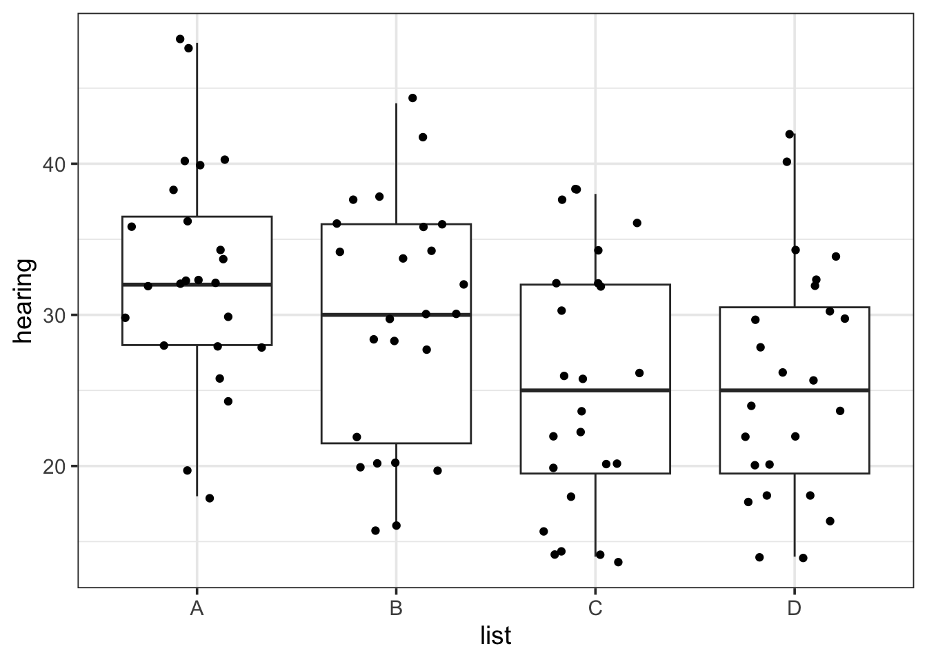
In this case we see that there are some difference between the groups: the scores are somewhat lower for lists C and D than for lists A and B. But there is also a lot of overlap. It is hard to know whether we we have sufficient evidence to confidently believe that these differences would hold up if we tested the entire population.
It’s time to fit a model.
16.2.3 Fitting a model
To compare the four lists, we can use the model hearing ~ 1 + list. As we have just discussed, the model hearing ~ 1 + list will include 4 terms: an intercept and 3 terms for three of the four indicator variables. We can see this in the standard regression summary output for this model.
| term | Estimate | Std Error | t | p-value |
|---|---|---|---|---|
| (Intercept) | 32.8 | 1.61 | 20.3 | 0.00 |
| listB | −3.08 | 2.28 | −1.35 | 0.18 |
| listC | −7.50 | 2.28 | −3.29 | 0.00 |
| listD | −7.17 | 2.28 | −3.14 | 0.00 |
The last three p-values in this table correspond to the hypotheses:
- \(H_0\): \(\beta_1 = 0\) (List B is no different on average from list A)
- \(H_0\): \(\beta_2 = 0\) (List C is no different on average from list A)
- \(H_0\): \(\beta_3 = 0\) (List D is no different on average from list A)
It may be tempting to draw a conclusion based on the p-values that appear in this table, but it would be a mistake to do so for several reasons:
Our primary question is whether all for lists are equivalent or not.
This set of hypotheses does not include other differences we may be interested in. (Are lists C and D different from each other?)
No correction is being made for multiple comparisons. With four lists, there are three comparisons listed here, but 6 total comparisons. (Missing are B vs C, B vs D, and C vs D.) We need to make an adjustment to our interpretation of p-values when we are looking at multiple tests. In this situation, a Bonferonni adjustment over-corrects. We will see something better shortly.
16.2.4 Diagnosics
Before proceeding with analysis, we should check that the model is reasonable by examining the residuals.

Linearity: There isn’t really anything to check here for this model since the model allows each group to have any mean whatsoever.
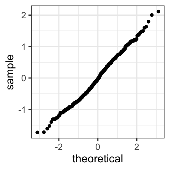
Normality: The normal-quantile plot looks pretty good. The largest and smallest residuals are a bit less extreme than we would expect for a normal distribution. But the rest of the distribution fits the normal expectation very well.
Equal Variance: The four clusters in the residuals by fits plots correspond to the four lists. The amount of spread in each is very similar. We could also compute the standard deviations or variances for each group. For this type of model, we generally would like to see that the largest standard deviation is no more than twice as large as the smallest standard deviation. In our case, they are all very close, so we have no concerns here.
| response | list | mean | sd | var |
|---|---|---|---|---|
| hearing | A | 32.8 | 7.41 | 54.9 |
| hearing | B | 29.7 | 8.06 | 64.9 |
| hearing | C | 25.2 | 8.32 | 69.2 |
| hearing | D | 25.6 | 7.78 | 60.5 |
Things are looking good for this model and data set. We can proceed with our analysis.
16.2.5 The One-Way ANVOA table
Our primary question is whether all four lists are equivalent, whether average hearing scores would be the same whichever list was used for testing. The corresponding null hypothesis is
- \(H_0\): \(\mu_1 = \mu_2 = \mu_3 = \mu_4\) (All four means are the same.)
Since the four group means are \(\mu_1 = \beta_0\), \(\mu_2 = \beta_0 + \beta_1\), \(\mu_3 = \beta_0 + \beta_2\), and \(\mu_4 = \beta_0 + \beta_3\), this can also be written as
- \(H_0\): \(\beta_1 = \beta_2 = \beta_3 = 0\) (\(\beta_1\), \(\beta_2\), and \(\beta_3\) are all zero.)
We already know how to test this hypothesis: We can us a model comparison test comparing the nested models hearing ~ 1 and hearing ~ 1 + list. This test is usually presented in an ANOVA table something like this:
| term | df | Sum Sq | Mean Sq | F | p-value |
|---|---|---|---|---|---|
| list | 3 | 920 | 307 | 4.92 | 0.00325 |
| Residuals | 92 | 5,740 | 62.4 |
Since there are 4 levels for
list, the larger model has 3 additional terms. This is presented as the degrees of freedom in thelistrow.RSS for the larger model is 5738. This is presented in the residuals row. The degrees of freedom is 92 because \(n = 4 \cdot 24 = 98\) and 1 degree of freedom is for the intercept and 3 for the terms for
listleaving 92 for the residuals.RSS for the smaller model is 920.5 greater than for the larger model. (Equivalently, SSM is 920.5 smaller.) This appears in the
Sum Sqcolumn.\(F = \frac{920.5 / 3}{5738 / 92} = 4.92\) and results in a p-value of 0.00325.
Our p-value is small enough to cause us to reject that null hypothesis at usual significance levels: Our data suggest that the word lists are not all equally hard to hear in the context of background noise.
16.2.6 The post hoc test and multiple comparisons
So where do we go from here? We have evidence that the lists are not all the same, but we don’t know if there is one list that is especially easy or hard or whether each list is different from all the others. We would like to follow up and find out more. This follow-up is sometimes referred to as a post hoc test – we wouldn’t do it if we were not able to reject the hypothesis that all the lists were equivalent.
In this case we have 6 pairwise comparisons between word lists: A vs B, A vs C, A vs D, B vs C, B vs D, and C vs D. As we have seen, three of these tests are reported in the standard linear model coefficient summary table, but three are not, and no adjustment is made in that table for multiple comparisons – the fact that we are looking at 6 different hypotheses.
One approach would be to conduct all 6 tests and use a Bonferroni correction, requiring the p-value to be below $0.05 / 6 = 0.0083 in order to reject any of the null hypotheses. We’d still have a bit of work to do to compute the three p-values that don’t appear in the initial table. We could do this either by changing which list is equivalent to the intercept or by creating explicit indicator variables using model comparison tests. Of course, all of this could be automated for us in statistical software.
But in this case, a Bonferonni correction is too severe because the tests are not independent of one another. (If lists A and B are very different from each other, then C can’t be similar to both of them, for example.) John Tukey is credited with coming up with a different correction that is designed for this specific situation. The method is called Tukey’s Honest significant Differences or sometimes just the Tukey test.
The goal of Tukey’s procedure to to adjust p-values and confidence intervals so that, assuming \(\alpha = 0.05\),
If the null hypothesis is true (there are no differences in the mean hearing scores for the 4 lists), then there is only a 5% chance that that any of the six pairwise tests will allow us to reject the null hypothesis that two of the lists have different mean hearing scores. (5% is referred to as the family-wise type I error rate.)
95% of samples produce six confidence intervals for the six differences between group means that all contain the true (population) difference in means. (95% is referred to as the family-wise confidence level.)
The details are not as important as the big ideas: We need to make our confidence intervals wider and adjust our p-value threshold to take into account that we are doing 6 different tests. If we fail to do this, we run the risk of thinking our data provide more evidence than they in fact provide.
The results of Tukey’s method are usually presented in a table with one row for each pairwise comparison. The table below gives the upper and lower bounds for an adjusted confidence interval, and an “adjusted p-value”. The adjustment to the p-value allows us to compare to our desired significance level \(\alpha\) without needing to do any division.
| comparison | diff | lwr | upr | p adj |
|---|---|---|---|---|
| B-A | −3.08 | −9.05 | 2.88 | 0.532 |
| C-A | −7.50 | −13.5 | −1.53 | 0.00764 |
| D-A | −7.17 | −13.1 | −1.20 | 0.0118 |
| C-B | −4.42 | −10.4 | 1.55 | 0.220 |
| D-B | −4.08 | −10.0 | 1.88 | 0.284 |
| D-C | 0.333 | −5.63 | 6.30 | 0.999 |
Notice that the p-values for rows B - A, C - A, and D - A are all larger than the corresponding values in the original summary table, but the ratios are not as severe as a Bonferroni 6:1 adjustment. For example in the second row:
- original p-value: 0.00142,
- adjusted p-value: 0.00764,
- ratio: 0.00764 / 0.00142 = 5.38
Often the Tukey-adjusted confidence intervals are displayed graphically so it is easier to see the results.
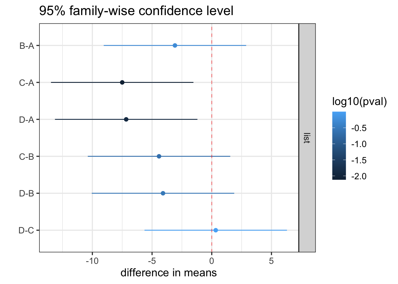
Based on Tukey’s Honest significant Differences, we have sufficient data to conclude that lists C and D are different from list A, but we do not have enough evidence to conclude any of the other pairs of lists are different from each other (in terms of mean hearing scores). The confidence intervals also give us some idea how much the lists could reasonably be expected to differ. List C, for example, appears to be “harder” than list A. A Tukey-adjusted 95% confidence interval for the difference in mean hearing scores for the two lists is 1.5 to 13.5 percent.
All of the intervals are fairly wide, with margins of error around 5 or 6%. If a narrower interval is required, more data will be needed.
Reminder: these intervals are quantifying what our data tell about how the means differ in the population. They are not about individuals in our population, and certainly not about our data.
16.2.6.1 Dunnet’s Comparisons and Contrasts
If we are interested only in comparing one group (perhaps a control or benchmark of some sort) to each of the others, there is another correction method known as “Dunnet’s comparisons”. Because fewer tests are involved, the adjustment doesn’t need to be as large as in Tukey’s method. This test is not as commonly used as Tukey’s method and may be harder to use (or unavailable) in some software.
More generally, there are methods that can be used to adjust for various sets of following up tests and confidence intervals. Each of these comparisons is referred to as a contrast. We won’t cover these methods here, but it is good to know that they are available.
The most important thing to remember is that when conducting a suite of tests or create multiple confidence intervals, some adjustment must be made. The Bonferroni adjustment is simple, but often more severe than is required.
16.2.7 Summary of One-Way ANOVA
To explore whether several groups have different mean values of a response variable Y, we can
Fit a model with formula
Y ~ 1 + group.We should check our residuals to see that they suggest that normality is plausible and that the variation is not too dissimilar among the groups. (A commonly used benchmark suggests that the largest standard deviation should be not more than twice the smaller one.)
Conduct a 1-way ANOVA test to see if there is sufficient evidence to conclude that the means are not all the same. (Rejecting the null hypothesis that all the means are the same.)
If we reject that null hypothesis, we can do a post hoc test (really multiple tests) for each of the head-to-head comparisons of one group with another. These tests (and the associated intervals) must be adjusted for the number of tests (intervals) being done. Tukey’s Honest significant Differences makes an appropriate adjustment for this situation.
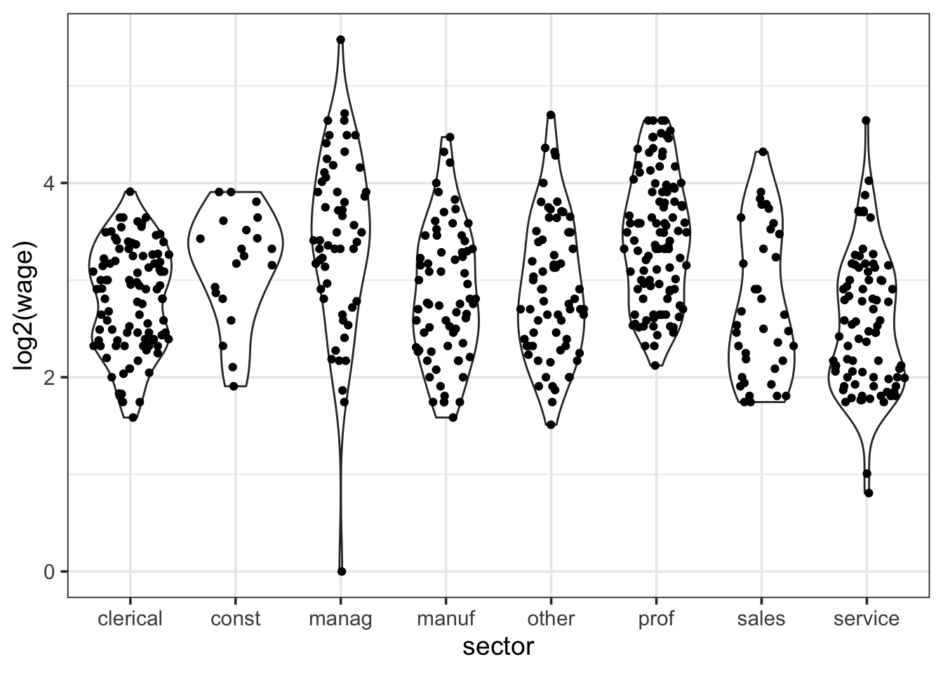
16.2.8 Example: Wage by sector
Let’s use the Current Population Survey of 1985 to see if wages differed by job sector.
We’ll begin by taking a look at the data with a plot and a table of statistics

| response | sector | mean | sd |
|---|---|---|---|
| wage | clerical | 7.422577 | 2.699018 |
| wage | const | 9.502000 | 3.343877 |
| wage | manag | 12.704000 | 7.572513 |
| wage | manuf | 8.036029 | 4.117607 |
| wage | other | 8.500588 | 4.601049 |
| wage | prof | 11.947429 | 5.523833 |
| wage | sales | 7.592632 | 4.232272 |
| wage | service | 6.537470 | 3.673278 |
Each group is skewed right, and the largest standard deviation (7.5) is quite a bit larger than the smallest one (2.6). These are potential problems for One-Way ANOVA. But using a log transformation improves both. We’ll log base 2 hear so a difference of 1 in log wages means one wages is twice as large as the other.
16.2.8.1 Using a log-transformation
| response | sector | mean | sd |
|---|---|---|---|
| log2(wage) | clerical | 2.79 | 0.545 |
| log2(wage) | const | 3.15 | 0.575 |
| log2(wage) | manag | 3.41 | 0.929 |
| log2(wage) | manuf | 2.84 | 0.689 |
| log2(wage) | other | 2.91 | 0.706 |
| log2(wage) | prof | 3.43 | 0.658 |
| log2(wage) | sales | 2.73 | 0.752 |
| log2(wage) | service | 2.53 | 0.700 |
The only downside is that the model is a bit less natural to talk about. (We don’t usually think about income in log dollars.) But it is often the case that distributions related to money or income are heavily skewed (most people are clustered near each other, but a few people have incomes that are much, much larger.
Let’s proceed with our log-transformed data.
16.2.8.2 Some model output
Here is some output from our model.
log2(wage) ~ sector.| term | Sum Sq | df | F | p-value |
|---|---|---|---|---|
| sector | 56.3 | 7 | 16.7 | 0.0000000000000000000553 |
| Residuals | 253 | 526 |
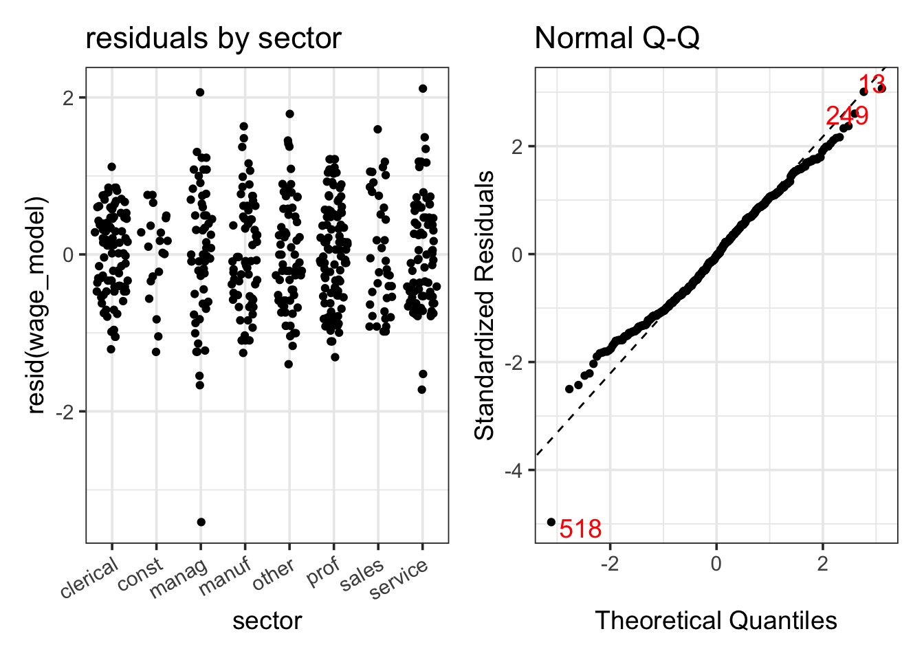
16.2.8.3 Observations
For these models, the residuals vs fits plot and a plot by groups show essentially the same information. The two differences are
In the plot of the data, the groups will shift up and down according to their group means. In the residual plot, they will all be centered at 0.
In the plot of the data, the groups will be evenly spaced across the x-axis. In the residual plot, they may cluster according to their group means.
The residual normal-quantile plot is not as good as we would prefer, but it is much better than the one we would get if we fit a model without the log transformation, and most of its issues are due to one observation (number 518). That is the one manager with a very low income. If we refit the model without that observation, the resulting normal-quantile plot is
- Because the ANOVA test has a small p-value, the evidence in our data suggest that the mean of log wages is not the same in each sector. We can use Tukey’s HSD to investigate which sectors differ from which others.
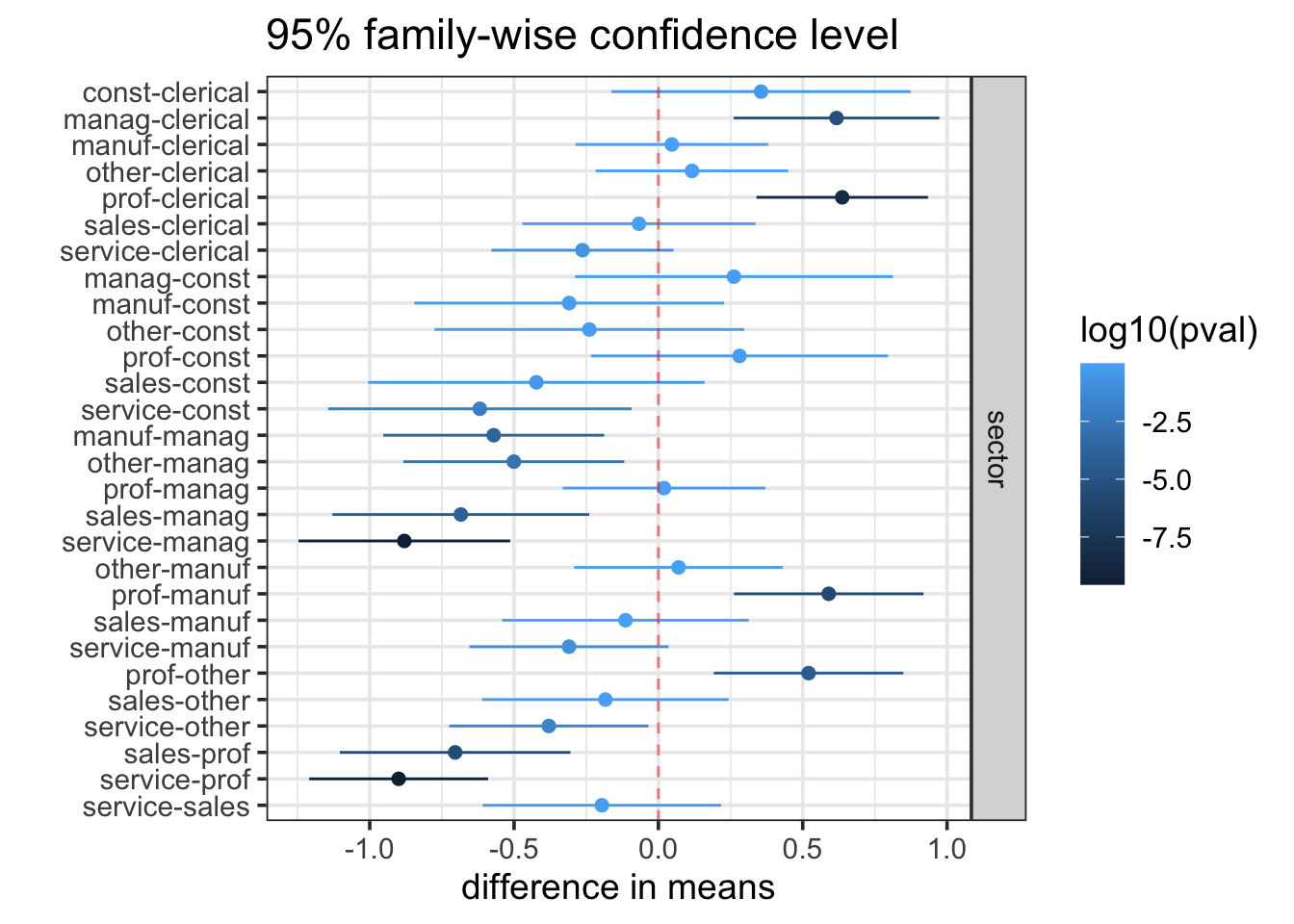
16.2.8.4 Tukey’s HSD
| comparison | diff | lwr | upr | p adj |
|---|---|---|---|---|
| const-clerical | 0.356 | −0.162 | 0.874 | 0.423 |
| manag-clerical | 0.617 | 0.261 | 0.973 | <0.001 |
| manuf-clerical | 0.0466 | −0.287 | 0.380 | 1.000 |
| other-clerical | 0.116 | −0.217 | 0.450 | 0.964 |
| prof-clerical | 0.637 | 0.340 | 0.934 | <0.001 |
| sales-clerical | −0.0672 | −0.471 | 0.337 | 1.000 |
| service-clerical | −0.263 | −0.578 | 0.0524 | 0.182 |
| manag-const | 0.262 | −0.289 | 0.812 | 0.836 |
| manuf-const | −0.309 | −0.846 | 0.228 | 0.652 |
| other-const | −0.239 | −0.776 | 0.297 | 0.876 |
| prof-const | 0.281 | −0.233 | 0.796 | 0.712 |
| sales-const | −0.423 | −1.01 | 0.160 | 0.348 |
| service-const | −0.619 | −1.14 | −0.0932 | 0.009 |
| manuf-manag | −0.571 | −0.953 | −0.188 | <0.001 |
| other-manag | −0.501 | −0.883 | −0.118 | 0.002 |
| prof-manag | 0.0196 | −0.331 | 0.371 | 1.000 |
| sales-manag | −0.684 | −1.13 | −0.239 | <0.001 |
| service-manag | −0.880 | −1.25 | −0.513 | <0.001 |
| other-manuf | 0.0699 | −0.292 | 0.432 | 0.999 |
| prof-manuf | 0.590 | 0.262 | 0.918 | <0.001 |
| sales-manuf | −0.114 | −0.541 | 0.313 | 0.993 |
| service-manuf | −0.310 | −0.655 | 0.0354 | 0.116 |
| prof-other | 0.520 | 0.192 | 0.849 | <0.001 |
| sales-other | −0.184 | −0.611 | 0.244 | 0.896 |
| service-other | −0.379 | −0.724 | −0.0345 | 0.020 |
| sales-prof | −0.704 | −1.10 | −0.305 | <0.001 |
| service-prof | −0.900 | −1.21 | −0.590 | <0.001 |
| service-sales | −0.196 | −0.609 | 0.217 | 0.837 |
16.3 Multiple categorical predictors
This section will focus on the following example.
Example 16.2 (SkyWest Direct Mailing Experiment) In an attempt to make some decisions before an even larger mailing, SkyWest decided to create an experiment to see how different types of mailings were related to the amount of money customers charge to their SkyWest credit card in the three months after receiving a mailing with a credit card offer. The study looked at two variables related to the mailing.
Envelope type: The envelopes were either standard envelopes or more expensive envelopes with a fancy logo.
Offer type: The mailing contained no special offer, an offer of double miles, or a “use anywhere” double miles offer that allowed the miles to be used on other airlines.
30000 customers were randomly assigned one of six treatment groups. 5000 customers received each of the 6 combinations
| envelope | offer | Freq |
|---|---|---|
| Standard | No Offer | 5000 |
| Logo | No Offer | 5000 |
| Standard | Double Miles | 5000 |
| Logo | Double Miles | 5000 |
| Standard | Use Anywhere | 5000 |
| Logo | Use Anywhere | 5000 |
The total amount spent by each customer over the three months after the mailing was used as the response variable.
A violin plot of the
The data are available at https://dasl.datadescription.com/datafile/direct-mail/
16.3.1 Understanding the model
Fitting a model for this situation is straightforward. The response is purchases and there are two predictors: envelope and offer. So our model formula is
\[ \texttt{purchases} \sim \texttt{1} + \texttt{envelope} * \texttt{offer} \]
But just what is this model? Looking at the coefficients summary gives us our first clue.
| term | estimate | std.error | statistic | p.value |
|---|---|---|---|---|
| (Intercept) | 1610.940820 | 17.4 | 92.4 | 0 |
| envelopeLogo | 151.219098 | 24.7 | 6.13 | 0.00000000087 |
| offerDouble Miles | 104.877100 | 24.7 | 4.25 | 0.000021 |
| offerUse Anywhere | 183.875386 | 24.7 | 7.46 | 0.000000000000090 |
| envelopeLogo:offerDouble Miles | 7.055004 | 34.9 | 0.202 | 0.84 |
| envelopeLogo:offerUse Anywhere | 32.952008 | 34.9 | 0.945 | 0.34 |
Since envelope and offer are categorical, they get converted into indicator variables which we will abbreviate as:
- for envelope:
envL[envSomitted from model] - for offer:
offD,offU[offNomitted from model]
The model has six terms
an intercept
3 main effects terms:
envL,offerDandoffU2 interaction terms:
enveL:offDandenvelopeD:offU– one for each possible product of an envelope main term and an offer main term.
So this model becomes
\[ \texttt{purchases} \sim 1 + \underbrace{\texttt{envL} + \texttt{offD} + \texttt{offU} }_{\mbox{main effects}} + \underbrace{ \texttt{envL:offD} + \texttt{envL:offU} }_{\mbox{interaction}} \]
\[ \widehat{\texttt{purchases}} = \beta_0 + \underbrace{\beta_1 \cdot \texttt{envL} + \beta_2 \cdot \texttt{offD} + \beta_3 \cdot \texttt{offU} }_{\mbox{main effects}} + \underbrace{ \beta_4 \cdot \texttt{envL:offD} + \beta_5 \cdot \texttt{envL:offU} }_{\mbox{interaction}} \] This model can fit any mean to any treatment group:
| no offer | double miles | use anywhere | |
|---|---|---|---|
| standard envelope | \(\beta_0\) | \(\beta_0 + \beta_2\) | \(\beta_0 + \beta_3\) |
| logo envelope | \(\beta_0 + \beta_1\) | \(\beta_0 + \beta_1 + \beta_2 + \beta_4\) | \(\beta_0 + \beta_1 + \beta_3 +\beta_5\) |
But organizing things this way (instead of just using 6 means, \(\mu_1, \mu_2, \mu_3, \mu_4, \mu_5, \mu_6\)) is important for the analysis that we will do in a moment because it lets us separate out the two main effects and the interaction. This will help us interpret the results of out model.
16.3.2 The Two-Way ANOVA Table
The standard ANOVA table for a Two-Way ANOVA looks like this:
| term | Sum Sq | df | F | p-value |
|---|---|---|---|---|
| envelope | 203,000,000 | 1 | 134 | 0.000000000000000000000000000000747 |
| offer | 201,000,000 | 2 | 66.2 | 0.0000000000000000000000000000205 |
| envelope:offer | 1,510,000 | 2 | 0.495 | 0.609 |
| Residuals | 45,600,000,000 | 29994 |
This table shows the results of 3 model comparison tests.
envelope:offer–purchases ~ 1 + envelope * offervspurchases ~ 1 + envelope + offer.Null hypothesis: there are no interactions between
envelopeandoffer.This is usually the first row to look at.
If there is a significant interaction, the the effect of one of the categorical variables depends on the value of the other. If, as in this case, we cannot reject a null hypothesis of no interaction, then it is easier to interpret what is happening in terms of “main effects” for each of our categorical predictors.
envelope–purchases ~ 1 + envelope + offervspurchases ~ 1 + offer.- Because we do not have a significant interaction effect, we can interpret this small p-value as saying that there is a significant effect of envelope. We can reject the hypothesis that the customers make the same mean amount of purchases regardless of the envelope used.
offer–purchases ~ 1 + envelope + offervspurchases ~ 1 + envelope.- Because we do not have a significant interaction effect, we can interpret this small p-value as saying that there is a significant effect of offer. We can reject the hypothesis that the customers make the same mean amount of purchases regardless of the offer received.
So in this case, it appears both the envelope and the offer matter, but there is no evidence of an interaction between the two.
16.3.3 Coefficient Estimates, Multiple Comparisons, and Contrasts
So how big are the main effects? There are a couple of ways we could attempt to answer this.
Let’s start by looking at our coefficient table.
| term | Estimate | Std Error | t | p-value |
|---|---|---|---|---|
| (Intercept) | 1,610 | 17.4 | 92.4 | 0 |
| envelopeLogo | 151 | 24.7 | 6.13 | 0.000000000866 |
| offerDouble Miles | 105 | 24.7 | 4.25 | 0.0000210 |
| offerUse Anywhere | 184 | 24.7 | 7.46 | 0.0000000000000895 |
| envelopeLogo:offerDouble Miles | 7.06 | 34.9 | 0.202 | 0.840 |
| envelopeLogo:offerUse Anywhere | 33.0 | 34.9 | 0.945 | 0.345 |
We can use those standard errors to create confidence intervals for each coefficient:
| coefficient | 2.5 % | 97.5 % |
|---|---|---|
| (Intercept) | 1,580 | 1,650 |
| envelopeLogo | 103 | 200 |
| offerDouble Miles | 56.6 | 153 |
| offerUse Anywhere | 136 | 232 |
| envelopeLogo:offerDouble Miles | −61.3 | 75.4 |
| envelopeLogo:offerUse Anywhere | −35.4 | 101 |
But what does the coefficient for envelope mean? Recall this table.
| no offer | double miles | use anywhere | |
|---|---|---|---|
| standard envelope | \(\beta_0\) | \(\beta_0 + \beta_2\) | \(\beta_0 + \beta_3\) |
| logo envelope | \(\beta_0 + \beta_1\) | \(\beta_0 + \beta_1 + \beta_2 + \beta_4\) | \(\beta_0 + \beta_1 + \beta_3 +\beta_5\) |
If there were really no interaction, then \(\beta_4\) and \(\beta_5\) would each be 0, and the difference between row 1 and row two would be the same in each column: \(\beta_1\). That’s the coefficient for envelope. Of course, we don’t know that there is 0 interaction – we just don’t have enough evidence to be sure it isn’t 0. Nevertheless, when we don’t have significant interaction, this interval is often interpreted as the difference between mean spending depending on which envelope is used. (We will see another option in shortly.) The interval here is \(151.20 \pm 48.3 = (\$102.90, \$199.50)\). That’s a wide interval, but even the lower end is over $100. Not all of that increased purchasing is profit, but someone at SkyWest should be able to determine if the amount of additional profit resulting from a $100 increase in spending is enough to justify the added costs of the more expensive envelope.
For offer we have 3 groups and two parameters. Again, if there were no interaction at all, the offerD coefficient would be the difference in mean purchases between no offer group and the double miles group, and this would be the same for both envelope types. (Subtract the values in column 1 from the values in column 2 assuming \(\beta_4 = 0\) and you get \(\beta_2\) each time.) We get a similar result if we subtract column 1 from column 3 assuming \(\beta_5\) is 0: \(\beta_3\), the coefficient for offerU. Again, we don’t know that those interaction coefficients are 0, so this isn’t exactly the right thing to do. But the two intervals are there for us. Again, the intervals are wide, but they may be sufficient for making a business decision. This one is more complicated because it may require some additional modeling to predict how many customers will redeem their miles, and how many of the redeemed miles will be with other airlines. This model only answers one part of the question: how much more do customers spend on average if they are given different offers.
What about comparing the double miles group with the use anywhere double miles group? If we do the arithmetic, we see that if \(\beta_5 = 0\), then the difference is \(\beta_3 - \beta_2\) in each row. That difference does not correspond to one of the rows in our tables, so for now, we will have to wait to get a confidence interval for that difference.
16.3.3.1 Tukey’s method
We have 6 treatments, so there are 15 possible pairs of treatment we might want to compare. Tukey’s Honest significant Differences will adjust for these 15 potential comparisons and compute 15 adjusted confidence intervals (and adjusted p-values).
Note
Tukey’s method is only appropriate for balanced designs or mildly unbalanced designs. A balanced design is one where each group has the same number of observations, as in the SkyWest example. When performing experiments, we can usually arrange for this because we control how the treatments are allocated. In an observational study, this might not be the case. Other adjustment methods can be used in those situations, but they won’t be covered in this text.
| diff | lwr | upr | p adj |
|---|---|---|---|
| 151 | 81.0 | 221 | <0.001 |
| 105 | 34.6 | 175 | <0.001 |
| 263 | 193 | 333 | <0.001 |
| 184 | 114 | 254 | <0.001 |
| 368 | 298 | 438 | <0.001 |
| −46.3 | −117 | 23.9 | 0.415 |
| 112 | 41.7 | 182 | <0.001 |
| 32.7 | −37.6 | 103 | 0.771 |
| 217 | 147 | 287 | <0.001 |
| 158 | 88.0 | 229 | <0.001 |
| 79.0 | 8.75 | 149 | 0.017 |
| 263 | 193 | 333 | <0.001 |
| −79.3 | −150 | −9.03 | 0.016 |
| 105 | 34.6 | 175 | <0.001 |
| 184 | 114 | 254 | <0.001 |
If your model indicated a significant interaction, this is where would could look to make comparisons. Since it wouldn’t make sense to talk about how much difference the envelope makes without knowing the offer made, it would be important to make specific comparisons of the type listed here. Of course, we can also use them when we don’t have a statistically significant interaction.
This gives another answer to the question: How much does the type of envelope matter? Actually, it gives us three slightly different answers:
- If we make no special offer: ($80.97, $221.5)
- If we offer double miles: ($88.02, $228.5)
- If we offer use anywhere double miles: ($113.9, $254.40)
These intervals are not exactly the same; this reflects the possibility of some interaction. (Failing to reject a null hypothesis does not make it true.) They are also wider, both because they adjust for 3 comparisons and because they take into account the uncertainty related to a possible interaction.
This answer (these answers) are not as easy to communicate as a single estimate and confidence interval, so we have yet another option. Here is the output of Tukey’s method for our two main effects.
| comparison | diff | lwr | upr | p adj |
|---|---|---|---|---|
| Logo-Standard | 165 | 137 | 192 | <0.001 |
Table 16.16: Tukey HSD for two models.
The confidence interval for the difference in the mean amount of purchases made by those receiving the logo envelope (with any one of the three offers) and those receiving the standard envelope (with any one of the three offers) is ($136.70, $192.40). That is a pretty wide interval, but not as wide as the other intervals we have seen. Once again, even on the low end, customers receiving that fancy envelope would be making an additional $136 of purchases per customer over three months. Not all of that increase in spending is profit, but very likely the profit from these additional purchases will more than cover the additional costs of the fancy envelope.
There are three confidence intervals associated with the main effect for offer. If we compare the Use Anywher offer (most expensive for SkyWest), we see that our model estimates additional spending of $91.95 with a confidence interval of ($51.09, $132.8). Again, that is a wide interval, but it can be used to correctly present what our data tell us (and don’t tell us). A cost-benefit analysis can be used to determine if the extra revenue is enough to offset the additional expense. This might require another model to determine, for example, how likely people are to actually use the miles that they earn and whether they use them on SkyWest flights or on some other airline.
But what are these intervals? These intervals compare averages of averages. As we saw above, our model values for the difference between standard and logo envelopes depends on which offer is being made. We could take the average of those three and create a confidence interval for that – an average of averages.
In terms of our model coefficients, this is the following expression:
\[ \underbrace{\frac{\beta_0 + (\beta_0 + \beta_2) + (\beta_0 + \beta_3)}{3}}_{\mbox{average in first row}} - \underbrace{ \frac{(\beta_0 + \beta_1) + (\beta_0 + \beta_1 + \beta_2 + \beta_4) +(\beta_0 + \beta_1 + \beta_3 + \beta_5)}{3}}_{\mbox{average in second row}} \] We could create similar expressions for comparing one column to another.
That’s pretty complicated looking. Here’s all we need to know about it:
Expressions like this are called contrasts, and there is a systematic way to get the standard error for any contrast. Statistical software takes care of all the arithmetic for us.
The big idea is
- to average away the differences due to offer when looking at the difference due to envelope.
- to average away the difference due to envelope, when looking at the differences due to offer.
- when multiple comparisons arise (as for the three different offers) there is also an adjustment made for that.
16.3.3.2 Bonferonni correction
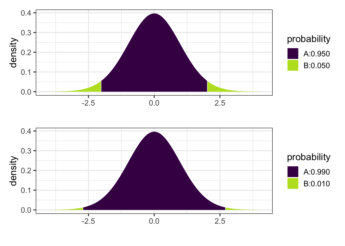
If there are a lot of potential comparisons and we know in advance of the study that we will only be interested in a smaller subset of them, we could instead do a Bonferonni correction. A Bonferonni corrected confidence interval use the regular standard error, but adjust the critical value \(t_*\) to a larger number, let’s call it \(t_{**}\).
For example, if we have potential interest in 5 comparisons, then instead of using the central 95% of a t-distribution, we would use the central 99% of the distribution because 0.05 / 5 = 0.01.
This makes it relatively easy to convert a non-adjusted interval into a Bonferonni adjusted interval. For example, if we have 40 residual degrees of freedom, then
\[ t_* = -2.021 \qquad t_{**} = -2.704 \] so we must multiply the margin of error by \(\frac{-2.704}{-2.021} = 1.338\).
But be careful here. After seeing your data, you may only be interested in a few comparisons, but that is not the same as saying you would not have been interested in different comparisons had the data been different. This effect is sometimes referred to as “researcher degrees of freedom” and includes not just more ways to look at your model, but also other models you might have chosen to look at. It is not appropriate to do many different analyses (or have the potential to do many different analyses) and then present the results as if you had one particular analysis in mind in advance.
16.3.3.3 Other correction methods
There are a number of other correction methods, each one designed to deal with a particular situation. We won’t cover those in this text, but it is good to know that they exist. If you see them in someone else’s work, you will know that they are attempting to address the multiple comparisons issue and being up front about the issue and how they are dealing with it.
16.3.4 Checking Conditions
We’ve probably gone too long without considering whether this model was a good idea in the first place. Let’s do some diagnostics.
16.3.4.1 Linearity
Again, the model allows for any mean to be fit to any group, so this assumption cannot be violated here. (It could, if we omitted the interaction term.)
16.3.4.2 Independence
Independence is a consequence of assigning the treatment randomly. This is important. If we assigned the treatments in some systematic way, this could be violated.
16.3.4.3 Normality
Figure Figure 16.8 suggests that the groups are not normally distributed. We can see this in our residual plot as well

Yikes. That’s not just a few odd values. We have a lot of data and the overall pattern in the tails is strongly different from what we would expect for a normal distribution.
So why did we proceed? It turns out that the normality condition is important for small sample sizes, but not so much for large samples. This is due to the Central Limit Theorem which tells us that the sampling distribution for means becomes more and more like a normal distribution as the sample size gets larger no matter what the distribution of the population may be. So our methods are quite robust against departures from normality when the sample sizes are large.
16.3.4.4 Equal Variance
Figure Figure 16.8 suggests that the spread is pretty similar in each treatment group. We can check this numerically as well:
   response envelope        offer     mean       sd
1 purchases Standard     No Offer 1610.941 1020.184
2 purchases     Logo     No Offer 1762.160 1218.151
3 purchases Standard Double Miles 1715.818 1479.417
4 purchases     Logo Double Miles 1874.092 1345.057
5 purchases Standard Use Anywhere 1794.816 1143.912
6 purchases     Logo Use Anywhere 1978.987 1133.273
16.3.5 What about \(R^2\)?
You may have been surprised to see how small \(R^2\) is for this model: 0.0088. So less than 1% of the variation in total purchases made is explained by the type of mailing sent. Is this a problem? That depends on your perspective.
It would be very hard to predict for an individual how much they will charge to their credit card after receiving a mailing. There are many factors that influence this: household income, having other credit cards, when family birthdays fall, travel plans, age, etc. Our model doesn’t account for any of these, and we see a tremendous amount of individual variation in credit card purchases within each treatment group. If our goal is to make individual predictions, this model probably isn’t going to be very good. We might improve it greatly by adding some additional covariates.
But that wasn’t the point of the model. SkyWest is primarily interested in the total amount spent by their customers. That’s equivalent to knowing the mean amount of purchases. The model is good enough to suggest that some mailings lead to more purchases on average than others and to quantify how large the difference is.
Even with this large sample size, the intervals are quite wide – that’s due to the large individual to individual variation in purchases. But they are narrow enough to make a reasonable decision – they are narrow enough to be confident that some mailings work better than others in aggregate.
So even with it’s small \(R^2\), this model is useful for its intended purpose. That’s what matters.
Be careful of trying to assign to much importance to \(R^2\) on its own. What constitutes a “good” value of \(R^2\) depends a lot on context.
16.3.6 Why so much data?
This is a pretty large experiment: 5000 people in each of 6 treatment groups for a total of 30,000 subjects. Was that necessary? Presumably someone did a power analysis to determine how large the study should be. What might they have been targeting?
The key element of the analysis here is the confidence intervals for the size of the various effects. SkyWest wants to be confident that if they spend more on the mailings and offers they will make that money back in increased purchases. It is not enough to just get a small p-value and conclude that the effect is not 0, we need to know that it is sufficiently bigger than 0 to make up for the costs of the more expensive offers and envelopes.
So while the p-values here are quite small, the confidence intervals are still fairly wide. Narrow enough for us to make a decision, but if they were much wider, they might not be. Because the effect is on the order of $100 and variation is on the order of thousands of dollars, it takes a large data set to identify the effect within the variation.
Don’t focus on p-values if your primary interest is not what they are testing.
16.3.7 When there is interaction
When we are not able to reject the no interaction null hypothesis, then interpreting the results is more complicated because how one factor impacts the response variable depends on the value of the other factor. So it isn’t appropriate to talk about the affect of one factor in isolation.
For example, had there been an interaction here, the model could not tell us how changing from the standard envelope to the fancy envelope would impact its model value unless we also specified which offer was presented to the customer. Even in this model we saw a bit of this. The model fit is compatible with some amount of interaction, so we don’t get exactly the same difference when we compare the effect of envelope among those who receive no offer as we do when comparing the effect of envelope among customers one of the other two offer groups.
So our usual procedure will be to first check if there is evidence for an interaction. If not, we can proceed to investigate the two main effects, as we have done here. Tukey’s method provides a nice way of dealing with the possibility of an interaction and puts all the groups on equal footing.
If there is evidence of an interaction, then we avoid talking about one predictor without specifying what we are assuming about the other predictor. We can still create p-values or confidence intervals comparing any pair of treatment conditions, but in the presence of interaction, the interaction terms in the model may play an important role in these comparisons.
An interaction plot is often a good way to visualize whether there is an interaction and, if so, what sort of interaction. An interaction plot shows the means for each of the, in this case 6, groups displayed in a way that lets you see the two factors of the experiment. Here are two variations:
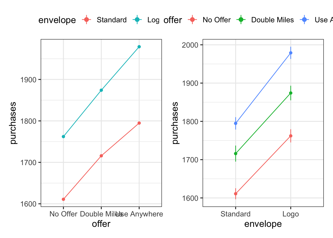
The fact that the line segments are nearly parallel is an indication that there is not a strong interaction effect.
16.4 Categorical predictors together with quantiative predictors
This chapter has focused on categorical predictors on there own, but categorical and quantitative predictors can be used in the same model. Categorical predictors will be converted into the appropriate number of indicator variables just as we saw in the examples above.