10 Total and Partial Change
I do not feel obliged to believe that the same God who has endowed us with sense, reason, and intellect has intended us to forgo their use. —Galileo Galilei (1564-1642)
One of the most important ideas in science is experiment. In a simple, ideal form of an experiment, you cause one explanatory factor to vary, hold all the other conditions constant, and observe the response. A famous story of such an experiment involves Galileo Galilei (1564-1642)
dropping balls of different masses but equal diameter from the Leaning Tower of Pisa.1 Would a heavy ball fall faster than a light ball, as theorized by Aristotle 2000 years previously? The quantity that Galileo varied was the weight of the ball, the quantity he observed was how fast the balls fell, the conditions he held constant were the height of the fall and the diameter of the balls. The experimental method of dropping balls side by side also holds constant the atmospheric conditions: temperature, humidity, wind, air density, etc.
Of course, Galileo had no control over the atmospheric conditions. By carrying out the experiment in a short period, while atmospheric conditions were steady, he effectively held them constant.
Today, Galileo’s experiment seems obvious. But not at the time. In the history of science, Galileo’s work was a landmark: he put observation at the fore, rather than the beliefs passed down from authority. Aristotle’s ancient theory, still considered authoritative in Galileo’s time, was that heavier objects fall faster.
The ideal of “holding all other conditions constant” is not always so simple as with dropping balls from a tower in steady weather. Consider an experiment to test the effect of a blood-pressure drug. Take two groups of people, give the people in one group the drug and give nothing to the other group. Observe how blood pressure changes in the two groups. The factor being caused to vary is whether or not a person gets the drug. But what is being held constant? Presumably the researcher took care to make the two groups as similar as possible: similar medical conditions and histories, similar weights, similar ages. But “similar” is not “constant.”
But sometimes it is not possible to “hold all other conditions constant”. A central question is whether there is a way to mimic “holding all other conditions constant.” For example, suppose we want to know how class size affects academic performance of students. We can compare student performance in large and small classes, but there may be other ways that students in these classes differ. Some classes may be taught by well-paid teachers and some taught by poorly-paid teachers; some students may come from families with positive parental involvement and some not; perhaps school administrators choose to put weaker students into smaller classes where they will receive more help; perhaps class sizes are smaller in schools that have more funding; and so on. Is there a way to isolate the impact of class size on performance even though we can’t hold all these other things constant the way we would like?
In this chapter you’ll see how models can be used to examine data as if some variables were being held constant. Perhaps the most important message of the chapter is that there is no point hiding your head in the sand; simply ignoring a variable is not at all the same thing as holding that variable constant. By including multiple variables in a model you make it possible to interpret that model in terms of holding the variables constant. But there is no methodological magic at work here. The results of modeling can be misleading if the model does not reflect the reality of what is happening in the system under study. Understanding how and when models can be used effectively, and when they can be misleading, will be a major theme of the remainder of the book.
10.1 Total and Partial Relationships
The common phrase “all other things being equal” is an important qualifier in describing relationships. To illustrate: A simple claim in economics is that a high price for a commodity reduces the demand. For example increasing the price of heating fuel will reduce demand as people turn down thermostats in order to save money. But the claim can be considered obvious only with the qualifier all other things being equal. For instance, the fuel price might have increased because winter weather has increased the demand for heating compared to summer. Thus, higher prices may be associated with higher demand. Unless you hold other variables constant – e.g., weather conditions – increased price may not in fact be associated with lower demand.
In fields such as economics, the Latin equivalent of “all other things being equal” is sometimes used: ceteris paribus. So, the economics claim would be, “higher prices are associated with lower demand, ceteris paribus.”
Although the phrase “all other things being equal” has a logical simplicity, it’s impractical to implement “all.” Instead of the blanket “all other things,” it’s helpful to be able to consider just “some other things” to be held constant, being explicit about what those things are. Other phrases along these lines are “taking into account …”, “controlling for ….”, and “adjusting for…”.
Such phrases apply when you want to examine the relationship between two variables, but there are additional variables that may be coming into play. The additional variables are called covariates.
A covariate is just an ordinary variable. The use of the word “covariate” rather than “variable” indicates that it’s not an explanatory variable of primary interest, but it may also be associated with the response variable in a way that makes it challenging to see the association of primary interest. This is a variable that we would ideally like to “hold constant.”
Example 10.1 (Covariates and Death) This news report appeared in 2007:
Heart Surgery Drug Carries High Risk, Study Says.
A drug widely used to prevent excessive bleeding during heart surgery appears to raise the risk of dying in the five years afterward by nearly 50 percent, an international study found.
The researchers said replacing the drug – aprotinin, sold by Bayer under the brand name Trasylol – with other, cheaper drugs for a year would prevent 10,000 deaths worldwide over the next five years.
Bayer said in a statement that the findings are unreliable because Trasylol tends to be used in more complex operations, and the researchers’ statistical analysis did not fully account for the complexity of the surgery cases.
The study followed 3,876 patients who had heart bypass surgery at 62 medical centers in 16 nations. Researchers compared patients who received aprotinin to patients who got other drugs or no antibleeding drugs. Over five years, 20.8 percent of the aprotinin patients died, versus 12.7 percent of the patients who received no antibleeding drug. This is a 64% increase in the death rate.
When researchers adjusted for other factors, they found that patients who got Trasylol ran a 48 percent higher risk of dying in the five years afterward.
The other drugs, both cheaper generics, did not raise the risk of death significantly.
The study was not a randomized trial, meaning that it did not randomly assign patients to get aprotinin or not. In their analysis, the researchers took into account how sick patients were before surgery, but they acknowledged that some factors they did not account for may have contributed to the extra deaths. - Carla K. Johnson, Associated Press, 7 Feb. 2007
The report involves several variables. Of primary interest is the relationship between (1) the risk of dying after surgery and (2) the drug used to prevent excessive bleeding during surgery. Also potentially important are (3) the complexity of the surgical operation and (4) how sick the patients were before surgery. Bayer disputes the published results of the relationship between (1) and (2) holding (4) constant, saying that it’s also important to hold variable (3) constant.
In the aprotinin drug example, the total relationship involves a death rate of 20.8 percent of patients who got aprotinin, versus 12.7 percent for others. This implies an increase in the death rate by a factor of 1.64. When the researchers looked at a partial relationship (holding constant the patient sickness before the operation), the death rate was seen to increase by less: a factor of 1.48. In evaluating the drug, it’s best to examine its effects holding other factors constant. So, even though the data directly show a 64% increase in the death rate, 48% is a more meaningful number since it adjusts for covariates such as patient sickness. The difference between the two estimates reflect that sicker patients tended to be given aprotinin. As the last paragraph of the story indicates, however, the researchers did not take into account all covariates. Consequently, it’s hard to know whether the 48% number is a reliable guide for decision making.
The term partial relationship describes a relationship with one or more covariates being held constant. A useful thing to know in economics might be the partial relationship between fuel price and demand with weather conditions being held constant. Similarly, it’s a partial relationship when the article refers to the effect of the drug on patient outcome in those patients with a similar complexity of operation.
In contrast to a partial relationship where certain variables are being held constant, there is also a total relationship: how an explanatory variable is related to a response variable letting those other explanatory variables change as they will. (The corresponding Latin phrase is mutatis mutandis.)
Example 10.2 (Health care plans) Here’s an everyday illustration of the difference between partial and total relationships. I was once involved in a budget committee that recommended employee health benefits for the college at which I work. At the time, college employees who belonged to the college’s insurance plan received a generous subsidy for their health insurance costs. Employees who did not belong to the plan received no subsidy but were instead given a moderate monthly cash payment. After the stock-market crashed in year 2000, the college needed to cut budgets. As part of this, it was proposed to eliminate the cash payment to the employees who did not belong to the insurance plan. This proposal was supported by a claim that this would save money without reducing health benefits. I argued that this claim was about a partial relationship: how expenditures would change assuming that the number of people belonging to the insurance plan remained constant. I thought that this partial relationship was irrelevant; the loss of the cash payment would cause some employees, who currently received health benefits through their spouse’s health plan, to switch to the college’s health plan. Thus, the total relationship between the cash payment and expenditures might be the opposite of the partial relationship: the savings from the moderate cash payment would trigger a much larger expenditure by the college.
Perhaps it seems obvious that one should be concerned with the “big picture,” the total relationship between variables. If eliminating the cash payment increases expenditures overall, it makes no sense to focus exclusively on the narrow savings from suspending the payment itself. On the other hand, in the aprotinin drug example, for understanding the impact of the drug itself it seems important to take into account how sick the various patients were and how complex the surgical operations. There’s no point ascribing damage to aprotinin that might instead be the result of complicated operations or the patient’s condition.
Whether you wish to study a partial or a total relationship is largely up to you and the context of your work. But certainly you need to know which relationship you are studying.
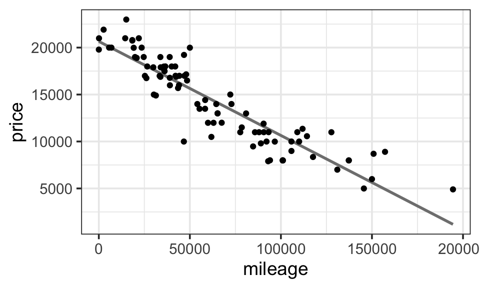
Example 10.3 (Used Car Prices) Figure 10.1 shows a scatter plot of the price of used Honda Accords versus the number of miles each car has been driven. The graph shows a pretty compelling relationship: the more miles that a car has been driven, the lower the price. This can be summarized by a simple linear model: price ~ mileage. Fitting such a model gives this model formula
\[ \widehat{\texttt{price}} = 20770 - 0.10 \cdot \texttt{mileage} \]
Keeping in mind the units of the variables, the price of these Honda Accords typically falls by about 10 cents per mile driven. Think of that as the cost of the wear and tear of driving: depreciation.
As the cars are being driven, other things are happening to them. They are wearing out, they are being involved in minor accidents, and they are getting older. The relationship shown in Figure 10.1 takes none of these into account. As mileage changes, the other variables such as age are changing as they will: a total relationship.
In contrast to the total relationship, the partial relationship between price and mileage holding age constant tells us something different from the total relationship. The partial relationship would be relevant, for instance, if we were interested in the cost of driving a car. This cost includes gasoline, insurance, repairs, and depreciation of the car’s value. The car will age whether or not we drive it; the extra depreciation due to driving it will be indicated by the partial relationship between price and mileage after adjusting for the age of the car.
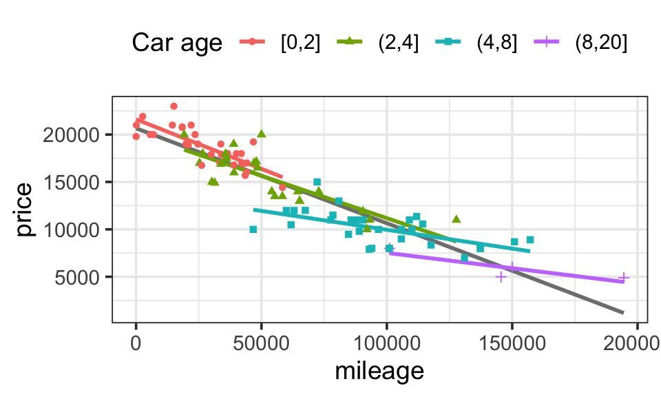
The most intuitive way to hold age constant is stratification: to look at the relationship between price and mileage for groups of the cars that are all the same (or nearly the same) age. This is shown in Figure 10.2. The cars have been divided into age groups (less than 2 years old, between 3 and 4 years old, etc.) and the data for each group has been plotted separately together with the best fitting linear model for the cars in that group. From the figure it’s easy to see that the slope of the fitted models for each group is shallower than the slope fitted to all the cars combined. Instead of the price falling by about 10 cents per mile as it does for all the cars combined, within the 4-8 year old group the price decrease is only about 7 cents per mile, and it is only 3 cents per mile for cars older than 8 years.
By looking at the different age groups individually, we are holding age approximately constant in our model. The relationship we find in this way between price and mileage is a partial relationship. Of course, there are other covariates that we did not consider. So, to be precise, we should describe the relationship we found as a partial relationship with respect to age or after adjusting for age.
10.2 Models and Partial Relationships
10.2.1 A simple model for price
Models make it easy to estimate the partial relationship between a response variable and an explanatory variable, after adjusting for one or more covariates.
The first step is to fit a model that includes both the explanatory variable of interest and the covariates as predictors. For example, to find the partial relationship between car price and miles driven, after adjusting for age, we can fit the model price ~ mileage + age. For the car-price data from Figure 10.1, this gives the model coefficient table
# A tibble: 3 × 2
  term          estimate
  <chr>            <dbl>
1 (Intercept) 21292.
2 mileage        -0.0653
3 age          -732.
The resulting model formula is
\[ \widehat{\texttt{price}} = 21292\cdot \texttt{(Intercept)} - 0.0653\cdot \texttt{mileage} - 732\cdot \texttt{age} \]
\[ \widehat{\texttt{price}} = 21292 - 0.0653 \cdot \texttt{mileage} - 732 \cdot \texttt{age} \]
The second step is to interpret this model as describing a partial relationship between price and mileage holding age constant. A simple way to do this is to plug in some particular value for age, say 1 year. With this value plugged in, the formula for price as a function of mileage becomes
\[ \widehat{\texttt{price}} = 21292 - 0.065 \cdot \texttt{mileage} - 732 \cdot \textbf{1} = 20560 - 0.065 \cdot \texttt{mileage} \]
The partial relationship is that model price goes down by 0.065 dollars per mile, holding age constant at 1. (In this particular model, the model price will decrease by 0.065 dollars per mile at every age. Try it for yourself with a differnt age to cofirm.)
Note the use of the phrase “estimate the partial relationship” in the first paragraph of this section. The model you fit creates a representation of the system you are studying that incorporates both the variable of interest and the covariates in explaining the response values. In this mathematical representation, it’s easy to hold the covariates constant in the model. If you don’t include the covariate in the model, you can’t hold it constant and so you can’t estimate the partial relationship between the response and the variable of interest while holding the covariate constant. But even when you do include the covariates in your model, there is a legitimate question of whether your model is a faithful reflection of reality; holding a covariate constant in a model is not the same thing as holding it constant in the real world. These issues, which revolve around the idea of the causal relationship between the covariate and the response, are discussed in Chapter 18.
10.2.2 A model with interaction
The model in the previous section does not reflect what we saw in Figure 10.2. In that figure, we see that the rate of decrease in price for each mile driven is greater for new cars than it is for old cars. We can fit a model that allows for this by adding in an interaction term: price ~ mileage + age + mileage:age or the shorter version price ~ mileage * age.
If we fit this model, we obtain the following table of coefficients.
# A tibble: 4 × 2
  term           estimate
  <chr>             <dbl>
1 (Intercept) 22433.
2 mileage        -0.0885
3 age         -1059.
4 mileage:age     0.00490
So the model formula is
\[ \widehat{\texttt{price}} = 22433 - 0.0885 \cdot \texttt{mileage} - 1059 \cdot \texttt{age} + 0.0049 \cdot \texttt{mileage} \cdot \texttt{age} \] We can rewrite this as
\[ \widehat{\texttt{price}} = \underbrace{(22433 - 1059 \cdot \texttt{age})}_{\texttt{intercept}} + \underbrace{( - 0.0885 + 0.0049 \cdot \texttt{age})}_{\texttt{slope}} \cdot \texttt{mileage} \]
So in this model, both the slope and the intercept depend on the age of the vehicle. In particular, the slope becomes less negative as age increases.
Again, in the model we can hold the age constant. For a 2 year old car we get
\[ \begin{aligned} \widehat{\texttt{price}} &= 22433 - 0.0885 \cdot \texttt{mileage} - 1059 \cdot \texttt{age} + 0.0049 \cdot \texttt{mileage} \cdot \texttt{2} \\ &= \underbrace{(22433 - 1059 \cdot \texttt{2})}_{\texttt{intercept}} + \underbrace{( - 0.0885 + 0.0049 \cdot \texttt{2})}_{\texttt{slope}} \cdot \texttt{mileage} \\ &= \underbrace{22315}_{\texttt{intercept}} + \underbrace{-0.0787}_{\texttt{slope}} \cdot \texttt{mileage} \end{aligned} \] So this model predicts that a 2-year-old car loses 7.9 cents of value for each additional mile driven.
For a 6-year-old car, the change in price per mile driven is different:
\[ \underbrace{( - 0.0885 + 0.0049 \cdot \texttt{6})}_{\texttt{slope}} = -0.0591 \]
So the model precits that a 6-year-old car loses only 5.9 cents of value for each additional mile driven.
10.2.3 Aside: Models and (partial) derivatives
10.2.3.1 Partial change and partial derivatives
If you are familiar with calculus and partial derivatives, you may notice that these estimated rates of decrease in price are the partial derivative of model estimated price with respect to mileage. Using partial derivatives allows one to interpret more complicated models relatively easily.
As an example, consider our model with the interaction term from the previous section:
\[ \widehat{\texttt{price}} = 22433 - 0.0885 \cdot \texttt{mileage} - 1059 \cdot \texttt{age} + 0.0049 \cdot \texttt{mileage} \cdot \texttt{age} \]
For this model, the partial relationship between price and mileage is not just the coefficient on mileage. Instead it is the partial derivative of price with respect to mileage, or:
\[ \frac{\partial \, \texttt{price}}{\partial \, \texttt{mileage}} = −0.0885 + 0.0049 \cdot \texttt{age} \]
Taking into account the units of the variables, this means that for a new car (age = 0), the price declines by $0.0885/mile, that is, 8.85 cents per mile. But for a 10-year old car, the decline is less rapid: −0.0885 + 10 = −0.0395 – only 4 cents a mile.
10.2.3.2 Interaction terms and partial derivatives
Partial derivatives also provide a way to think about interaction terms.
To measure the effect size of an explanatory variable, consider the partial derivative of the response variable with respect to the explanatory. Writing the response as z and the explanatory variables as x and y, the effect size of x corresponds to ∂z/∂x.
An interaction – how one explanatory variable modulates the effect of another on the response variable – corresponds to a mixed second-order partial derivative. For instance, the size of an interaction between x and y on response z corresponds to ∂²z / ∂x∂y.
A theorem in calculus shows that mixed partials have the same value regardless of the order in which the derivatives are taken. In other words, ∂²z / ∂x ∂y = ∂²z / ∂y∂x. This is the mathematical way of stating that the way x modulates the effect of y on z is the same thing as the way that y modulates the effect of x on z.
10.2.4 Adjustment
The table below contains the first few rows of a data set containing information about professional and sales employees of a large mid-western US trucking company: the annual earnings in 2007, sex, age, job title, how many years of employment with the company. Data such as these are sometimes used to establish whether or not employers discriminate on the basis of sex.
| sex | earnings | age | birth | title | hiredyears |
|---|---|---|---|---|---|
| M | 35000 | 25 | 6/15/82 | PROGRAMMER | 0 |
| F | 36800 | 62 | 8/26/45 | CLAIMS ADJUSTER | 5 |
| F | 25000 | 34 | 3/15/73 | RECRUITER | 1 |
| M | 45000 | 44 | 11/14/63 | CLAIMS ADJUSTER | 0 |
| M | 30000 | 34 | 1/16/73 | RECRUITER | 3 |
| M | 60000 | 46 | 5/6/61 | CLAIMS ADJUSTER | 0 |

A boxplot reveals a clear pattern: men are being paid more than women. (See Figure 10.3.) Fitting the model earnings ~ sex indicates the average difference in earnings between men and women:
| term | estimate |
|---|---|
| (Intercept) | 35501.250 |
| sexM | 4735.098 |
\[ \widehat{\texttt{earnings}} = 35501\cdot 1 + 4735\cdot \texttt{sexM} \]
Since earnings are in dollars per year, men are being paid, on average, $4735 more per year than women. This difference reflects the total relationship between earnings and sex, letting other variables change as they will.
Notice from the boxplot that even within the male or female groups, there is considerable variability in annual earnings from person to person. Evidently, there is something other than sex that influences the wages.
An important question is whether you should be interested in the total relationship between earnings and sex, or the partial relationship, holding other variables constant. This is a difficult issue. Clearly there are some legitimate reasons to pay people differently, for example different levels of skill or experience or different job descriptions, but it’s always possible that these legitimate factors are being used to mask discrimination.
For the moment, take as a covariate something that can stand in as a proxy for experience: the employee’s age. Unlike job title, age is hardly something that can be manipulated to hide discrimination. Figure 10.4 shows the employees’ earnings plotted against age. Also shown are the fitted model values of wages against age, fitted separately for men and women.
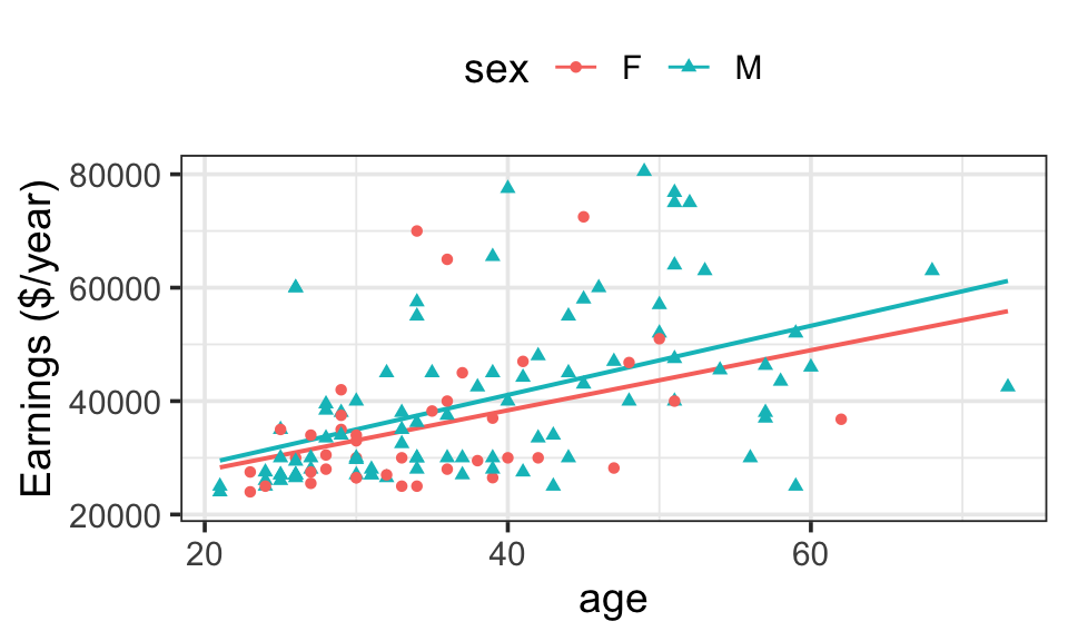
It’s evident that for both men and women, earnings tend to increase with age. The model design imposes a straight line structure on the fitted model values, but allows the slopes (and intercepts) to be different for men and for women. The formulas for the two lines are:
\[ \begin{aligned} \mbox{For Women:}\ \ \widehat{\texttt{earnings}} &= 17178 + 530 \cdot \texttt{age} \\ \mbox{For Men:}\ \ \widehat{\texttt{earnings}} &= 16735 + 609 \cdot \texttt{age} \end{aligned} \]
From the graph, you can see the partial relationship between earnings and sex, holding age constant. Pick an age, say 30 years. At 30 years, according to the model, the difference in annual earnings is $1931, with men making more. At 40 years of age, the difference between the sexes is even more ($2722), at 20 years of age, the difference is less ($1140). All of these partial differences (holding age constant) are substantially less than the difference when age is not taken into account ($4735).
| age | difference in earnings |
|---|---|
| 20 | 1140 |
| 30 | 1931 |
| 40 | 2722 |
| 50 | 3514 |
| 60 | 4305 |
One way to summarize the differences in earnings between men and women is to answer this question: How would the earnings of the men have been different if the men were women? Of course you can’t know all the changes that might occur if the men were somehow magically transformed, but you can use the model to calculate the change assuming that all other variables except sex are held constant. This process is called adjustment.
To find the men’s wages adjusted as if they were women, take the age data for the men and plug them into the model formula for women, using the model that includes both sex and age.
The difference between the earnings of men and women, adjusting for age, is $2610. This is much smaller than the difference, $4735, when earnings are not adjusted for age. Differences in age between the men and women in the data set appear to account for more than half of the overall earnings difference between men and women because younger employees are paid less and the female employees are younger than the male employees (as a group).
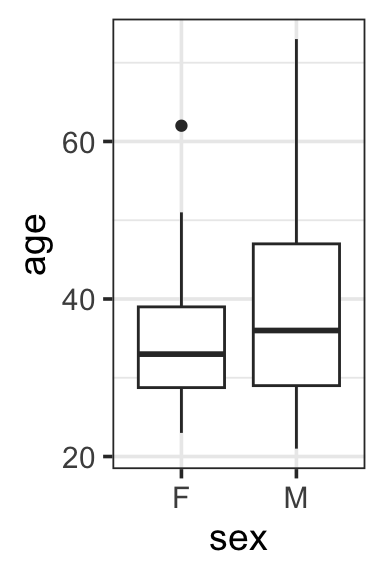
| response | sex | mean | median |
|---|---|---|---|
| age | F | 34.57500 | 33 |
| age | M | 38.58427 | 36 |
Of course, before you draw any conclusions, you need to know how precise these coefficients are. For instance, it’s a different story if the sex difference is \(2610 \pm 10\) or if it is \(2610 \pm 5000\). In the latter case, it would be sensible to conclude only that the data leave the matter of wage difference undecided. Later chapters in this book describe how to characterize the precision of an estimate.
Another key matter is that of causation. $2610 indicates a difference, but doesn’t say just where the difference comes from. By adjusting for age, the model disposes of the possibility that the earnings difference reflects differences in the typical ages of male and female workers. It remains to be found out whether the earnings difference might be due to different skill sets, discrimination, or other factors.
10.3 Simpson’s paradox and confounding
As we have already seen, when considering the association of a response variable with a particular explanatory variable, there may be additional variables (covariates) that change our understanding and interpretation of the association when they are included in the model. Omitting such confounding variables from our model might make the association appear stronger or weaker than it actually is. Sometimes the total relationship can even go in the opposite direction from the partial relationship. This is known as Simpson’s paradox.
Example 10.4 (Berkeley Admissions) One of the most famous examples of Simpson’s paradox involves graduate admissions at the University of California in Berkeley. It was observed that graduate admission rates were lower for women than for men overall. This reflects the total relationship between admissions and sex. But, on a department-by-department basis, admissions rates for women were consistently as high as or higher than the admission rates for men. The partial relationship, taking into account the differences between departments, was very different from the total relationship.
Example 10.5 (Cancer Rates Increasing?) Consider another example of partial versus total relationships. In 1962, naturalist author Rachel Carson published Silent Spring (Carson 1962), a powerful indictment of the widespread use of pesticides such as DDT. Carson pointed out the links between DDT and dropping populations of birds such as the bald eagle. She also speculated that pesticides were the cause of a recent increase in the number of human cancer cases. The book’s publication was instrumental in the eventual banning of DDT.
The increase in deaths from cancer over time is a total relationship between cancer deaths and time. It’s relevant to consider a partial relationship between the number of cancer deaths and time, holding the population constant. This partial relationship can be indicated by a death rate: say, the number of cancer deaths per 100,000 people. It seems obvious that the covariate of population size ought to be held constant. But there are still other covariates to be held constant. The decades before Silent Spring had seen a strong decrease in deaths at young ages from other non-cancer diseases which now were under greater control. It had also seen a strong increase in smoking. When adjusting for these covariates, the death rate from cancer was actually falling, not increasing as Carson claimed. (Tierney 2007)
10.4 Modeling with Covariates vs Stratification
The distinction between explanatory variables and covariates is in the modeler’s mind. When it comes to fitting a model, both sorts of variables are considered on an equal basis when calculating the residuals and choosing the best fitting model to produce a model function. The way that you choose to interpret and analyze the model function is what determines whether you are examining partial change or total change.
The intuitive way to hold a covariate constant is to do just that. In an experimental settings, it may be possible to control conditions so that the covariates of interest are held constant. Think of Galileo using balls of the same diameter and varying only the mass. In a clinical trial of a new drug, perhaps you would test the drug only on women so that you don’t have to worry about the covariate sex.
When you are not doing an experiment but rather working with observational data, you can hold a covariate constant by throwing out data. Do you want to see the partial relationship between price and mileage while holding age constant? Then restrict your analysis to cars that are all the same age, say 3 years old. Want to know the relationship between breath-holding time and body size holding sex constant? Then study the relationship in just women or in just men.
Stratificaiton (dividing data up into groups of similar cases), as in Chapter 4, is another intuitive way to study partial relationships. It can be effective, but it is not a very efficient way to use data. There are at least two disadvantages of stratification as compared with including covariates in a model. We can illustrate both in the context of the cars example.
Individual stratification groups may not have many cases. As we will see, this leads to very imprecise estimates.
For example, for the used cars shown in Figure 10.2 there are only a dozen or so cases in each of the groups. To get even this number of cases, the groups had to cover more than one year of age. For instance, the group labeled “age < 8” includes cars that are 5, 6, 7, and 8 years old. It would have been nice to be able to consider six-year old cars separately from seven-year old cars, but this would have left us with very few cases in either the six- or seven-year old group.
Cases in one group can provide information about cases in other groups, but stratification ignores this.
It seems reasonable to think that 5- and 7-year old cars have something to say about 6-year old cars; you would expect the relationship between price and mileage to shift gradually with age. For instance, the relationship for 6-year old cars should be intermediate to the relationships for 5- and for 7-year old cars.
Modeling provides a powerful and efficient way to study partial relationships that does not require restricting our data collection to special cases, discarding some of our data, or studying subsets of data separately from each other.
Just include multiple explanatory variables in the model. Whenever you fit a model with multiple explanatory variables, the model gives you information about the partial relationship between the response and each explanatory variable with respect to each of the other explanatory variables.
Example 10.6 (SAT Scores and School Spending) Chapter 7 showed some models relating school expenditures to SAT scores. The model sat ~ 1 + expend produced a negative coefficient on expend, suggesting that higher expenditures are associated with lower test scores. Including another variable, the fraction of students who take the SAT (variable frac) reversed this relationship.
The model sat ~ 1 + expend + frac attempts to capture how SAT scores depend both on expend and frac. In interpreting the model, you can look at how the SAT scores would change with expend while holding frac constant. That is, from the model formula, you can study the partial relationship between SAT and expend while holding frac constant.
The example also looked at a couple of other fiscally related variables: student-teacher ratio and teachers’ salary. The total relationship between each of the fiscal variables and SAT was negative – for instance, higher salaries were associated with lower SAT scores. But the partial relationship, holding frac constant, was the opposite: Simpson’s Paradox.
For a moment, take at face value the idea that higher teacher salaries and smaller class sizes are associated with better SAT scores as indicated by the following models:
\[ \begin{aligned} \widehat{\texttt{sat}} &= 988 + 2.18 \cdot \texttt{salary} - 2.78 \cdot \texttt{frac} \\ \widehat{\texttt{sat}} &= 1119 - 3.73 \cdot \texttt{ratio} - 2.55 \cdot \texttt{frac} \end{aligned} \]
In thinking about the impact of an intervention – changing teachers’ salaries or changing the student-teacher ratio – it’s important to think about what other things will be changing during the intervention. For example, one of the ways to make student-teacher ratios smaller is to hire more teachers. This is easier if salaries are held low. Similarly, salaries can be raised if fewer teachers are hired: increasing class size is one way to do this. So, salaries and student-teacher ratio are in conflict with each other.
If you want to anticipate what might be the effect of a change in teacher salary while holding student-teacher ratio constant, then you should include ratio in the model along with salary (and frac, whose dominating influence remains confounded with the other variables if it is left out of the model):
\[ \widehat{\texttt{sat}} = 1058 \cdot 1 + 2.55\cdot \texttt{salary} - 4.64\cdot \texttt{ratio} - 2.91\cdot \texttt{frac} \]
Comparing this model to the previous ones gives some indication of the trade-off between salaries and student-teacher ratios. When ratio is included along with salary, the salary coefficient is somewhat bigger: 2.55 versus 2.18. This suggests that if salary is increased while holding constant the student-teacher ratio, salary has a stronger relationship with SAT scores than if salary is increased while allowing student-teacher ratio to vary in the way it usually does when when salary is increased.
Of course, you still need to have some way to determine whether the precision in the estimate of the coefficients is adequate to judge whether the detected difference in the salary coefficient is real – 2.18 in one model and 2.55 in the other. Such issues are introduced in Chapter 12.
Efficiency starts to be a major issue when there are many covariates. Consider a study of the partial relationship between lung capacity and smoking, holding constant all these covariates: sex, body size, smoking status, age, physical fitness. There are two sexes and perhaps three or more levels of body size (e.g., small, medium, large). You might divide age into five different groups (e.g., pre-teens, teens, young adults, middle aged, elderly) and physical fitness into three levels (e.g., never exercise, sometimes, often). Taking the variables altogether, there are now 2 × 3 × 5 × 3 = 90 groups. It’s very inefficient to treat these 90 groups completely separately, as if none of the groups had anything to say about the others. A model of the form
lung capacity ~ body size + sex + smoking status + age + fitness
not only does the job more efficiently, but also avoids the need to divide quantitative variables such as body size or age into categories.
Example 10.7 (Vitamin D and cancer) To illustrate, consider this news report:
Higher vitamin D intake has been associated with a significantly reduced risk of pancreatic cancer, according to a study released last week.
Researchers combined data from two prospective studies that included 46,771 men ages 40 to 75 and 75,427 women ages 38 to 65. They identified 365 cases of pancreatic cancer over 16 years.
Before their cancer was detected, subjects filled out dietary questionnaires, including information on vitamin supplements, and researchers calculated vitamin D intake. After statistically adjusting for [that is, holding constant] age, smoking, level of physical activity, intake of calcium and retinol and other factors, the association between vitamin D intake and reduced risk of pancreatic cancer was still significant.
Compared with people who consumed less than 150 units of vitamin D a day, those who consumed more than 600 units reduced their risk by 41 percent. - New York Times, 19 Sept. 2006, p. D6.
There are more than 125,000 cases in this study, but only 365 of them developed pancreatic cancer. If those 365 cases had been scattered around dozens or hundreds of groups and analyzed separately, there would be so little data in each group that no pattern would be discernible.
10.5 Adjustment and Truth
It’s tempting to think that including covariates in a model is a way to reach the truth: a model that describes how the real world works, a model that can correctly anticipate the consequences of interventions such as medical treatments, changes in policy, business decisions, etc. This overstates the power of models.
A model design – the response variable and explanatory terms – is a statement of a hypothesis about how the world works. If this hypothesis happens to be right, then under ideal conditions the coefficients from the fitted model will approximate how the real world works. But if the hypothesis is wrong, for example if an important covariate has been left out, then the coefficients may not correctly describe how the world works.
In certain situations – the idealized experiment – researchers can create a world in which their modeling hypothesis is correct. In such situations there can be good reason to take the model results as indicating how the world works. For this reason, the results from studies based on experiments are generally taken as more reliable than results from non-experimental studies. But even when an experiment has been done, the situation may not be ideal; experimental subjects don’t always do what the experimenter tells them to and uncontrolled influences can sometimes remain at play.
It’s appropriate to show some humility about models and recognize that they can be no better than the assumptions that go into them. Useful object lessons are given by the episodes where conclusions from modeling (with careful adjustment for covariates) can be compared to experimental results. Some examples (from (Freedman 2008)):
- Does it help to use telephone canvassing to get out the vote? Models suggest it does, but experiments indicate otherwise.
- Is a diet rich in vitamins, fruits, vegetables and low in fat protective against cancer, heart disease or cognitive decline? Models suggest yes, but experiments generally do not.
The divergence between models and experiment suggests that an important covariate has been left out of the models.

The picturesque story of balls dropped from the Tower of Pisa may not be true. Galileo did record experiments done by rolling balls down ramps.↩︎